We’ve launched the Alpha Release for the new Tainacan, and so you are now to have a glimpse on how to build your collections, set your taxonomies, metadata, filters, and finally populate your collections with items. Now it’s time to discuss how you’ll show this items to the World, out from your admin panel.
Our goal is to make the presentation of collection’s items as flexible and customizable as possible.
Experienced WordPress users are well aware of what Themes are. They allow you to completely change the appearance of your website, even adding some specific features. The separation between presentation and administrative tasks makes it possible to show your content in many different ways, being it a blog post or a Tainacan collection’s item.
In order to explore this possibility along with people interested in using Tainacan, we are developing a first theme, which can help you present your collection in a beautiful, clean and effective visualization. In this brand new Tainacan theme, our plugin turns on the functionality of showing your items in a rich faceted search, but it is important to remind you that each and any WordPress Theme can increment this visualization offering in it’s own viewing modes.
View Modes
View Modes are basically visualization methods for showing a list of items. In our Tainacan Theme, we offer default view modes, the same that you’ll see in your administrative panel:
First there is The Table, just like the one you have on your admin panel, ready to receive all the metadata you need:
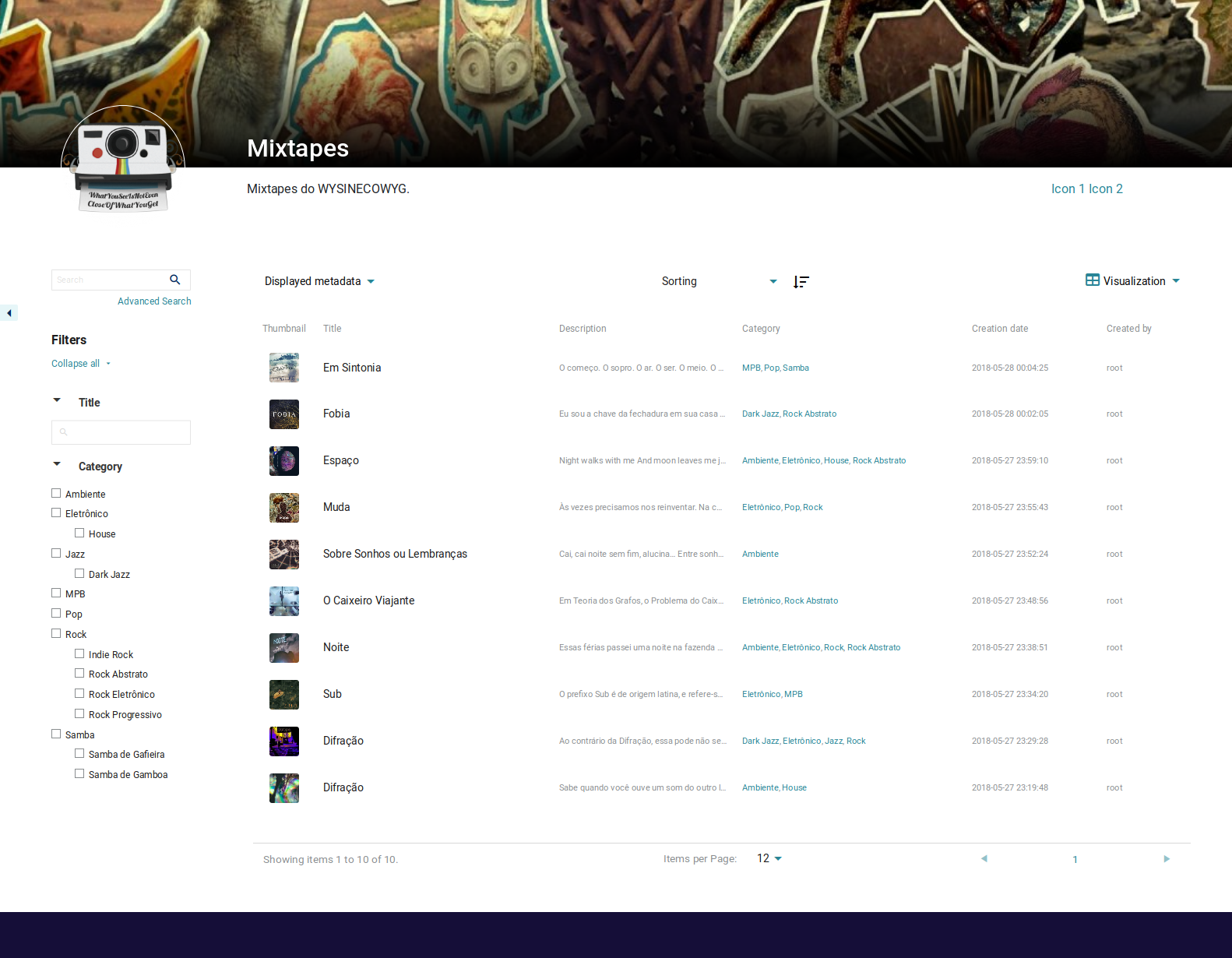
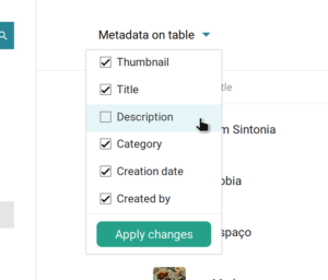
That is a great way to have an overall notion of your metadata. You may also notice that long texts are overlapped. You can see them in full hovering any metadata field. 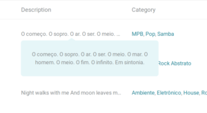 Once your metadata get’s abusive in terms of horizontal space, a scroll will appear to allow you to keep track of all your information. You may also want to display only some of the metadata (something that could also be set previously on metadata settings page). In this case, the top left menu is there for you.
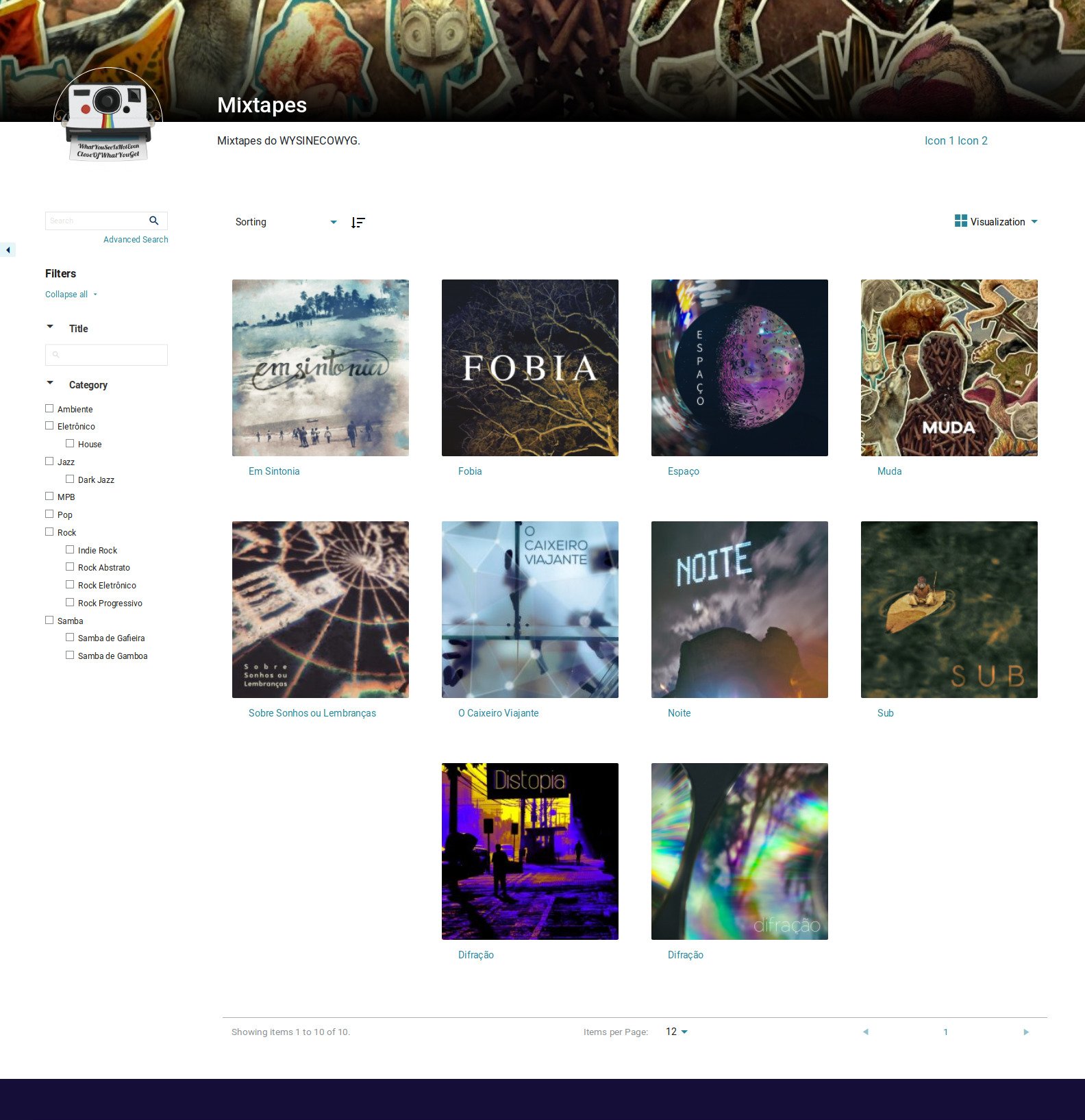
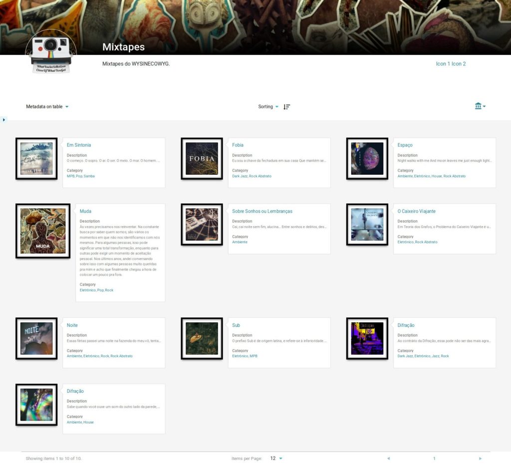
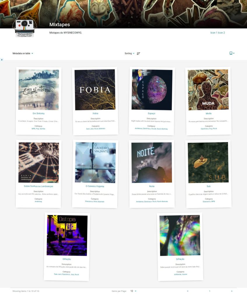
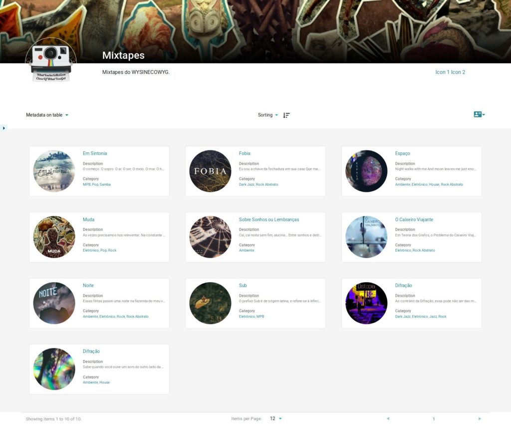
This all looks good, but there are other ways of visualizing your data than only in a bunch of rows. You may be interested in our Cards View Mode:
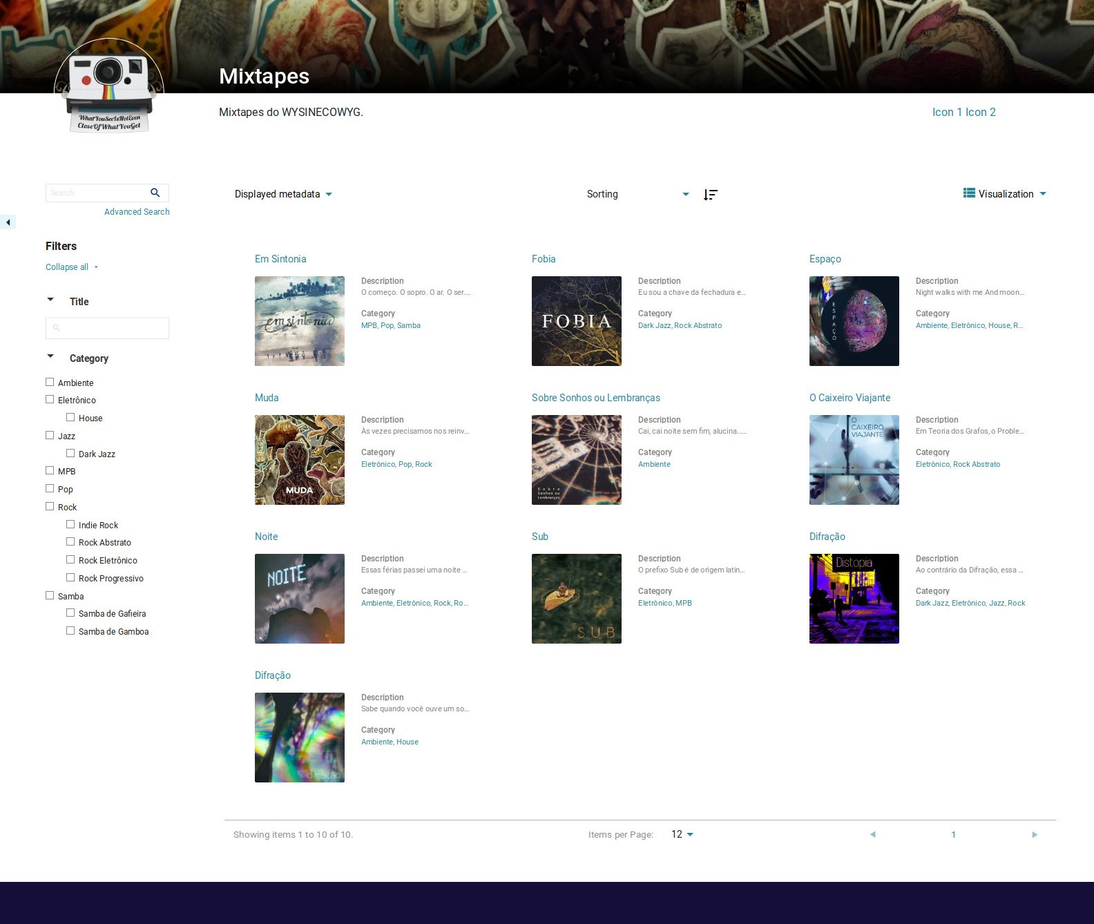
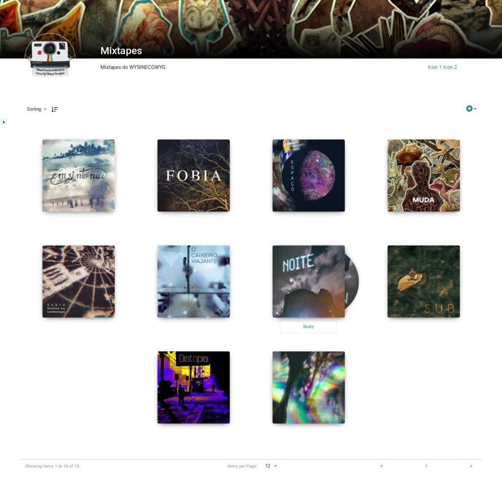
This is a clear way of presenting data, focusing on content but also giving a bit of presence to the thumbnail elected to represent the item. The fact is that in some cases, that thumbnail may say more than a thousand metadata. For those situations, you can use Grid View Mode:

If you’re paying attention, you’ll notice that the displayed metadata dropdown is gone here. Why? Because Grid View opted for making it’s visualization limited to Title and Thumbnail only. That sort of decision relies on View Modes settings to make their design consistent and responsible.
These are the basic view modes we developed to ship with the theme by default. We believe they will be able to respond to most cases. But that doesn’t mean we expect you to be lock on them. That’s why we’ve worked hard to made it very simple to build your own custom view modes, in order to show your collection in the way it fits you best. You can do this in your own theme, the one you already love. Creating a visualization mode is as simple as creating a custom CSS stylesheet. And from that on, creativity is your limit…
Custom View Modes
As we said, we’ve worked hard to make it really easy for a developer to create a new View Mode and leverage the powerful and complex faceted search interface Tainacan provides. As a matter of fact, it is so easy that once it was ready we could not help ourselves experimenting and creating different ways of displaying items for a diversity of situations. What you will see below are just experiences. Chances are that some of them will make their way and become part of the Tainacan package.
One of our researchers wanted to make a collection of Illustrations of Brazilian and Mexican Birds, where the focus of his items page was mostly on displaying art itself. So we though we could bring part of the experience of his last visit to the museum, offering a bit of frame to the paintings:

The Frame View Mode is responsive, support any aspect ratio for the image, and can give you a feeling of walking through that gallery. Oh, if you haven’t noticed yet, filters menu can be hidden to give you a better view of the items list 😉
Now, some might say that frames are an unnecessary boundary here. Why not get rid of them and compose a Mosaic View Mode?

At the top right, you can see the view mode selection dropdown. Notice that this view mode also seems to hide the Item Title. It chooses to present it only when hovering images. That goes well with a series of beautiful pictures, but what if all your items are an archive of papers or literacy? While the Cards View Mode may offer you what you need, you can still make it more attractive:
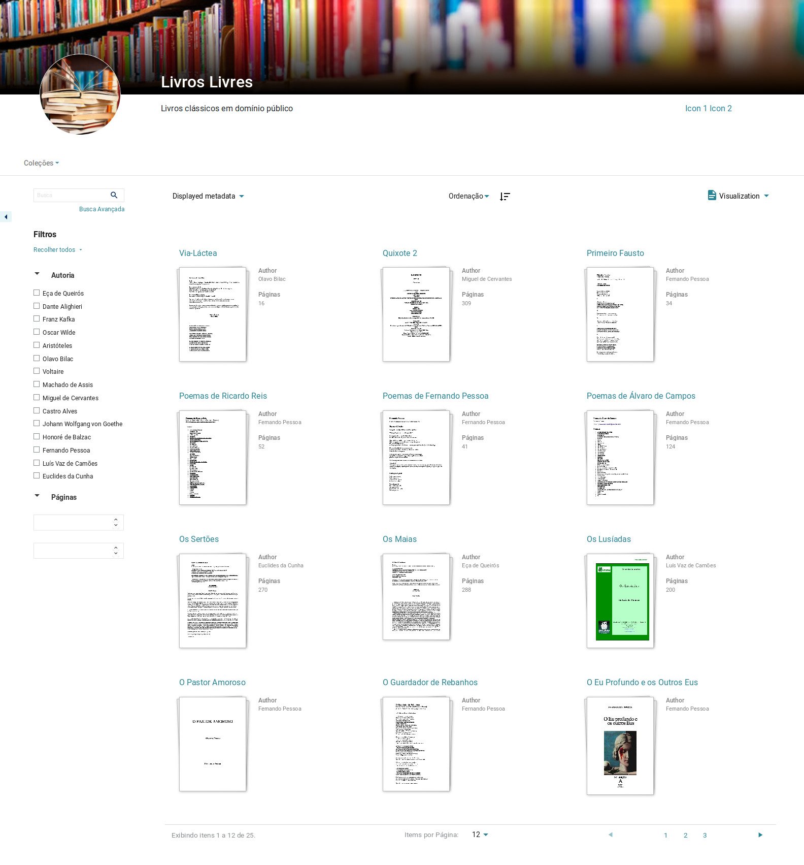
We call this a Document View Mode. But since the collection exemplifying here is a Books collection, we could go even further, chose better covers for the Items and give our digital library a new look with Books View Mode:
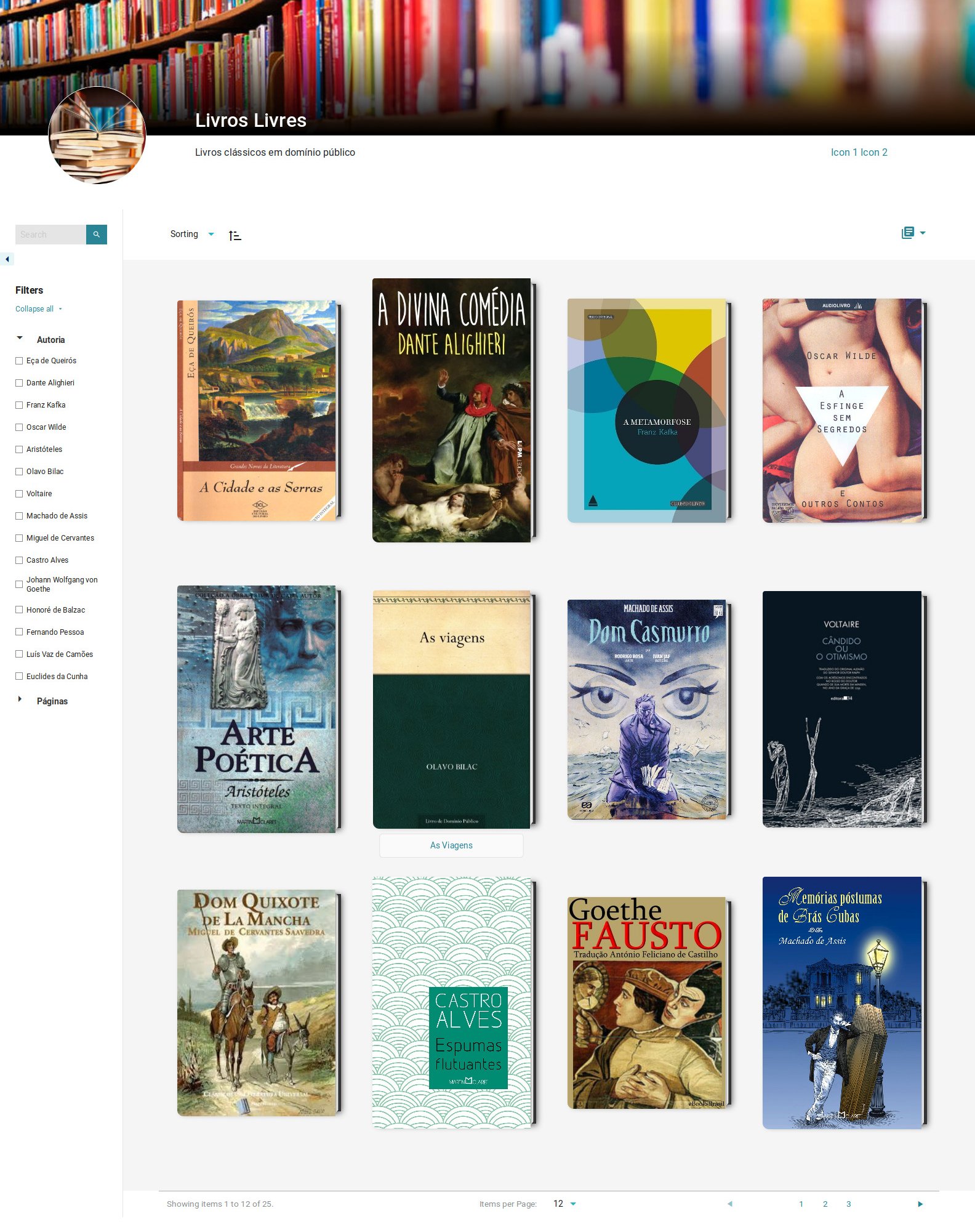
Be creative with us
As we said, many are the possibilities, and we hope that our strategy for registering view modes will allow developers to customize them as they wish for any application with Tainacan. While we still need to finish some documentation for that, you can already check out how we are doing it, if you are a curious developer. Here, is where we register new view modes, and here and here is where we actually create the templates.
We’ll present below a few other layouts that we’ve been playing with so far – we admit, we may have gone a bit too far on these – you can also check their code on GitHub.
