We are working hard for the release of plugin version 0.14, which will bring some substantial features. In the meantime, in order not to block any major bug fixes or minor improvements that may be suggested, we are presenting an intermediate version, with some important tweaks made since 0.13. In addition, we took time to make some minor improvements to the Tainacan Interface theme.
Updates on Tainacan Beta 0.13.1
- Various performance tweaks to item metadata edit form. Especially for taxonomy taginputs, this screen should now be slower for installations with hundreds of metadata or thousands of taxonomies;
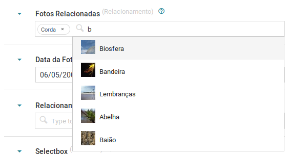
- Better display of autocompletes such as relationship search and terms, which now show thumbnails, if available;
- Adds a “steps” option to numeric type metadata, allowing you to increment values 1 by 1, 2 by 2, 0.01 by 0.01, etc;
- Fixes terms list sorting in the “parent term” selection autocomplete of the term edition form;
- Fixed terms removal and modal opening in taxonomy radio list;
- Correction of tags that did not appear in the modal of terms;
- Two column listing of metadata presented as checkbox or radio list;
- No longer offers “full screen” viewing modes as default for collection as this would cause navigation issues;
- Alignment and responsiveness adjustments in the cloud view mode of the Gutenberg Facets block;
- Exporter fixes for relationship type metadata;
- Terms API fixes;
These are details but they can make a difference to everyday routine, so we recommend updating now!
Updates on Tainacan Interface 1.5
- Changes to site’s logo cropping rules: Previously, the maximum height was 30px and the width was free, which only worked well for very horizontal logos like Tainacan’s. Now, while suggesting a smaller cutout, the user can climb a mark of any size that will display up to 225px wide and up to 120px tall. This will make the header higher if necessary. It will also allow better responsiveness to smaller screens, where the logo just pushed the search and menu buttons out;

- Break down menus with many options: Before, menus with many elements ended up hidden off the screen by a responsiveness error. Now, if there are many menus and the size of the screen where the mobile menu appears (768px) has not been reached, the menu will have a new line;
- Several submenu enhancements within the navigation menu;
- Improves the loading performance of third party fonts and scripts;
- Margin adjustments for Gutenberg Cover and Image and Media blocks;
- Color adjustments for the new Terms Carousel Block;
- Removes the header of pages that do not have a title;
- Some improvements in attachment viewing (but we have more work to do here ..);