Conteúdo
- 1 What’s new?
- 2 Improvements
- 2.1 New interface for insertion of taxonomies via checkboxes
- 2.2 Improvements in the insertion of new terms in taxonomy metadata
- 2.3 Improvements in the insertion of new items in relationship metadata
- 2.4 New size options in carousel blocks
- 2.5 Filters start collapsed if they have no values for the current facet
- 2.6 Direct links from terms to the list of items filtered by certain collections
- 2.7 Option to never display the thubmnail
- 2.8 Adjustments to the Full Screen/Gallery View Mode
- 2.9 Expose only selected items
- 2.10 Alternative description to Thumbnails
- 2.11 WordPress 5.5 compatibility
- 3 Bug fixes
- 4 For Developers
- 5 Tainacan Interface 2.2.1
- 6 Get it now!
From the wishes box we have for Tainacan, a request certainly echoes loudly for some months now: how to allow people to send items to my collection without having administrative access? Version 0.17 is here to finally present an official solution for such self-deposit of items, besides answering some other long-standing requests from our community. Come with us!
What’s new?
Item Submission Workflow
Not every collection arises from the hands of experts who manage a collection. Whether in curious projects such as the Museu das Coisas Banais, or in important initiatives such as the Covid-19 Repository of UnB, different strategies to allow the submission of items by people outside the team that manages the Tainacan have been developed. In this version this kind of interaction will be possible without the need of extra plugins. Lets see how it works:
- A collection is created, configured with the metadata describing your items, as usual;
- In the collection settings, a new option allows you to “Enable public submission of items”;
- You can then create a page or post on your site, and insert an Item Submission Form – that’s right, we have a new block!
- With the page configured and published, users will see on the page a very similar version of the form that administrators see of the item editing form, but public and ready to receive submissions!
This form will not necessarily be available to any user and will not necessarily be published immediately, although both are possible. We have specific settings to ensure that, for example, items submitted to the form are saved only as draft or as private, so that they can be reviewed by editors before they earn the honor of being an official part of the collection. All of these news are well described and documented on our Wiki. We recommend reading it:
We can’t wait to hear about how this resource can expand the possibilities of participation and collaboration in your collection. Much can still be improved, of course, and so we look forward to any suggestions or reports of errors in the mailing list, as always.
Filter by Document Type and Thumbnail
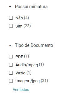
Filters in Tainacan are easily created from existing metadata. They allow you to create rich visualization in your list of items, thanks to the facets (even giving you a view of how many items have a certain metadata, before filtering) and of course, help you configure your blocks for the display pages. But not everything we want to filter about an item is a metadata in Tainacan. The “Document Type” and the “existence of a Thumbnail”, for example, are important information linked to the item, which are not created by the user as metadata, but generated by the system. Understanding that this is also a long-standing demand, we link this information to the system’s internal metadata, which we call control metadata. In practice, what this means is that in the metadata list from which filters are created, the Type of Document and the Miniature will be there now, available to create filters.
With the filter by document type, it’s easy to separate which PDF, audio or image items are in your collection. With the thumbnail filter, just one click will show you which items have had thumbnails set up and which have not. The control metadata are repository level, but you can create the filters both at the repository level and in specific collections.
Filter by Collection
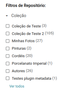
And taking advantage of the goodies of control metadata, other information seems to be very useful to filter: to which collection an item belongs, in lists of repository level items or the term of a taxonomy. In fact, there is already a filter by collections in these lists, but it is limited, because it does not show data in a dynamic way and does not give the preview of how many items there are in each collection with the current filtering.
So in this version we are removing this old collection filter. Now you can use the new collection level filter, but don’t forget to configure it in your repository level filter list!
List View Mode
It’s been a while since we last introduced a new view mode for the items list, so many people must be used to the records, the cards, the table and the masonry. Well, shaking off the dust a bit, we have a new way to see the items on the list of items… the “list”!
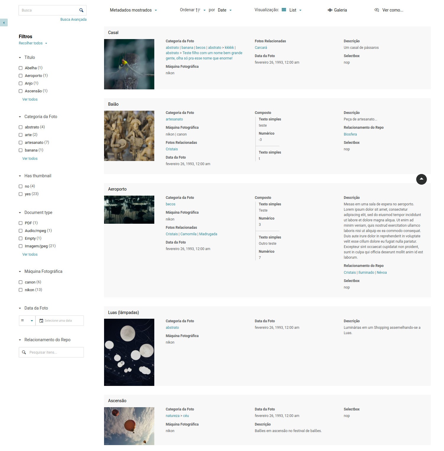
The new mode brings information at will like the records, but each item has horizontal space at its disposal to show its metadata (in a way becoming a card that is not limited only to the Description). If this new mode is interesting for your metadata, just enable it in your collection settings 😉
Ordenação e Títulos dos Anexos
Every item can contain, besides its main document, a series of attached files. Today this list of attachments is somewhat limited and little by little we are presenting some adjustments to give more control over what it does. We start by allowing manual sorting of attachments. It is done through the modal where they are edited. Once opened, just drag and drop the file boxes to leave them as you prefer:
It is also worth remembering that in this modal you can also change the titles of the attachments (which will appear in the attachments carousel in the public page of the item), besides providing an alternative description for them, which can be useful to improve the accessibility of your collection for people with visual impairment.
Full Screen starting from an Item
One of the most immersive ways to navigate between your items is using the Gallery mode or “Full Screen” of the item list. This view mode can be accessed by the button on the control bar, but whenever you click it starts showing the items from the first item on the list. What if you want to see a specific item in this gallery, and from it, navigate to others? Now, passing the mouse over the items, the same full screen button will appear on the item itself, allowing you to switch to the gallery from this item:
Error warnings
Those who have passed through our mailing list may have already come across the situation where developers needed to request error information through the browser console. This process is explained in our Wiki, but can be complicated to understand for novice users. Considering this, we now have a routine to expose the errors found in the interface through a notification that appears in the bottom right corner of the screen. It should provide a generic view of the error, with a button for a modal where some more technical details can be found and if necessary, forwarded to developers.
It wond’t be all types of errors, but mainly those related to connection and network, which should already help to clarify any problems faced.
Tipo de metadado URL embutida (por hora via plugin)
As we announced in version 0.16, Tainacan is increasingly ready to be complemented by third-party plugins. This allows us to isolate some functionalities in specific installations, offering features that not all users may be interested in. We started playing with this possibility by offering a new type of metadata, which can be used through a plugin. This is the Metadata Type URL.
The more adventurous may have discovered that in text metadata, you can place links that will be clickable. But what if you want, for example, to have several YouTube videos, with the player and everything there in your list? The URL type metadata comes to show embedded content that comes from other sites. It is an alternative for those who want to have more than one URL type document and possibly for those who want to show external attachments. To install the plugin, just go to your WordPress admin panel, in the plugins page and install the following:
Improvements
New interface for insertion of taxonomies via checkboxes
The taxonomy type metadata is probably one of the most relevant for several collections. To insert it in an item editing page, you can use either an auto-complete taginput or a checkbox list. This second mode, however, always seemed a bit more complicated, since it displayed only some of the first available terms and soon the user was obliged to click on “View all terms” to access the famous checkboxes modal, where a richer search and hierarchical navigation interface in taxonomy would be available. We decided to cut this step offering immediately the same interface as the modal, in the field itself. The list of options can start immediately visible, or come initially collapsed, according to a new configuration available in the metadata editing form.
Improvements in the insertion of new terms in taxonomy metadata
And taking advantage of the new entry of terms, how about we improve the creation of new term from the item edition form? Instead of the limited box with name and parent term that we have today, users will have at their disposal a complete form to configure the new term, without having to leave the item editing screen.
Improvements in the insertion of new items in relationship metadata
Following the same logic of inserting new terms via modal, you can now create new items for the relationship metadata also without leaving the current term editing screen. As crazy as it may sound, an item edition screen above an item edit screen… may be useful!
Notice that if you are using a taginput, when you do not find a particular item the suggestion box itself will offer you the option to create an item with that name, thus skipping the step of filling the title of the item.
New size options in carousel blocks
The items, collections and terms carousels are for sure are some of the preferred ones to assemble presentation pages of the collection. That’s why we are always wanting to improve them and this time we brought a new option, which allows us to define how many items per carousel line will be shown. By default, this block shows 6 to 7 items on large screens and decreases the number on smaller screens according to the space you have. Now this maximum number can be configured, so that your items are, for example, bigger! The most interesting thing is that we can even leave only one item, to put the carousel next to some textual content:
The novelty however brings a question: if the number of items per line is too small and the item gets too big, the thumbnail may not be available in a “cut square” version in the image database. Therefore, for smaller thumbnails, the traditional square cutout does not exist and a version without cutout will be presented in its original proportions. If when you discover this you are suddenly interested in having the uncut version even for smaller items, take advantage of the new “crop images” option which can be disabled just for this.
Filters start collapsed if they have no values for the current facet
That’s exactly what you read. If the filters applied at the moment make other filters to simply have no possible values, it does not make much sense to have a long list of filters with a warning message. That’s why we decided to save some of your vertical space by automatically collapsing them until they have something useful to offer you:
Direct links from terms to the list of items filtered by certain collections
If your item has a taxonomy-type metadata, the terms entered there will be links to the list of term items. This is a “repository level” list, because it will show, besides items from this collection, items from other collections that use this taxonomy in their metadata. As useful as this may be, perhaps your collection is not so interested in mixing with others in this way. That’s why we now have a new option, available in the taxonomy type metadata editing form. There, we can define if this list will be filtered by one or more collections when clicking on the term.
Option to never display the thubmnail
If your collection is composed of mostly textual items, it is quite possible that you do not have an image to represent them. This way, your list of items ends up turning into a bunch of gray boxes with Tainacan’s thumbnail placeholder. To get around this situation, we now have a collection configuration that asks to never display the thumbnail. This option will also automatically disable some display modes that primarily depend on the images, such as Masonry and Full Screen.
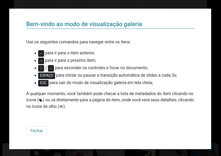
Adjustments to the Full Screen/Gallery View Mode
The beloved “Full Screen” or “Gallery” mode has some more news. Not only did he go through important bug fixes (like the annoying fact that sometimes it opens from the last item) but he gained some adjustments:
- Now we have an icon that takes you to the item’s page in the top right corner;
- The metadata list has also moved to the right side;
- A new help icon, also in the top right corner, offers a modal with instructions for use of the Full Screen mode, giving tips, for example, on the shortcuts for navigation via keyboard;
Expose only selected items
Remember that “View as..” button? The button that shows Exposers for the list of items in formats such as CSV, JSON or even PDF just got smarter. In the administrative part, you can select items via their checkboxes and ask to display only those selected in the same menu where bulk actions can be done:
Alternative description to Thumbnails
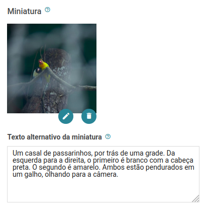
Meeting an old demand for accessibility, we are now facilitating the configuration of an alternative text for the thumbnail image of your item. The text placed in the box just below the miniature should describe the image content designed for people who may visit your site and have some visual impairment.
It is worth remembering that it is already possible to configure this text also for attachments and documents, at the moment they are inserted/edited by the WordPress media modal.
WordPress 5.5 compatibility
Last but not least, we have made adjustments to ensure compatibility with WordPress 5.5 and of course, its following versions 5.5.1, 5.5.2 and 5.5.3. Although you have nothing to worry about here since probably many of you have been using WP 5.5 for a few months now, some small visual improvements will be noticeable in the block editor, especially in the configuration controls:
Bug fixes
- Makes sure the manage_collection_x permission allow you to change the collection settings as well, not just your metadata, items, etc;
- Troubleshooting some bulk edition operations;
- Thumbnails of PDF covers with transparency now result in white background images instead of black;
- Hide the “Select all items” button when only one page exists;
- Redirection of the search block was not working on themes that do not support Tainacan;
- Avoids breaking the collection if a registered metadata type is no longer present;
- Numerical metadata was understanding the value 0 as “empty”;
- Metadata and filters inherited from a root collection were being created in reverse order to the root collection;
- Inserting relationship metadata via taginput was limited to 100 items and removing some values when duplicated;
- Avoiding the auto-focus of the filter modal if this is a side panel. This was causing a scroll to faceted search blocks in the middle of pages that used them;
- Embedded links such as Twits and Pages in the URL-type document had a huge margin below them;
- The CSV importer, when creating taxonomy type metadata now checks better whether they are multiple or not before assigning an input type (checkbox, taginput or radio);
For Developers
- Themes can now implement item-by-item navigation on their pages based on past queries when clicking on the item in the list;
- Themes can also take advantage of a strategy that observes if the screen scroll has passed from the top of the list and from the end of the list, with the insertion of is-filters-menu-fixed-at-top and is-filters-menu-fixed-at-bottom classes. With them it is possible to implement a list of fixed filters on the screen.
Tainacan Interface 2.2.1
And to put a chery on top, the theme Tainacan Interface also won a new version (which we released a couple of days ago) with important bug fixes and new integrations brought by this version of the plugin:
- New option to display the fixed filter panel according to the screen scroll. This option uses the new feature presented to developers in version 0.17 of the plugin. Just go to the menu “Customize” -> “Tainacan Items List Page” -> “Filter Panel” -> “Fixed Filters Panel with the scroll”.
- Error correction that was redirecting the Search Bar block of the plugin to wrong pages due to the global search function presented in version 2.1;
- Correction in the responsiveness of attachments, document and item navigation;
- Improvements in the translation of some terms;
Get it now!
Tainacan version 0.17 is now available. You can download it or update it directly from your WordPress panel: