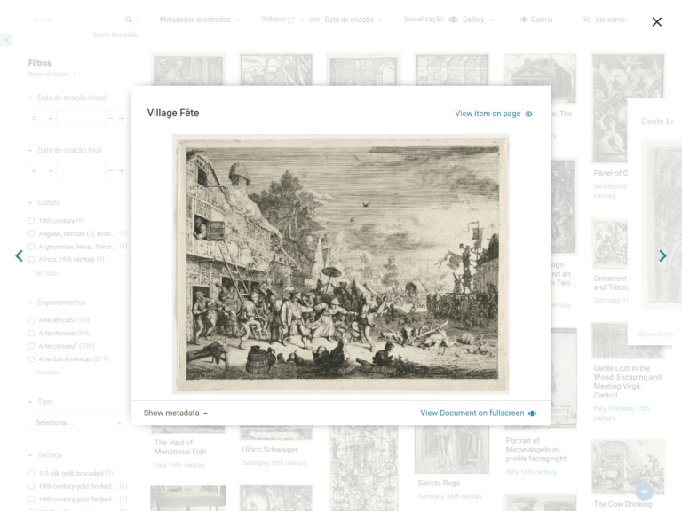
Tainacan taxonomies have always been powerful resources for creating categorization vocabularies for your digital collection. So we see several improvements that can be brought to the process of creating, editing and removing Taxonomy terms. In addition, these categorization forms can take on such importance that you may want to display them to the public on your site, in the same way that we display collections. With this update, we are giving more power to Taxonomies. Some of the new features also depend on updating the themes, so remember to have them in their latest version too!
Conteúdo
What’s new
Taxonomy and Terms list on website
In the top corner of the Tainacan admin panel, a new button is now available, which takes you to the Taxonomies list in the public part of the site in /taxonomies:

The list will have the default appearance of a traditional post listing for your theme. Clicking on a Taxonomy will redirect you to the List of Terms for that Taxonomy. See below for examples of this list in the Tainacan Interface and Blocksy, respectively:
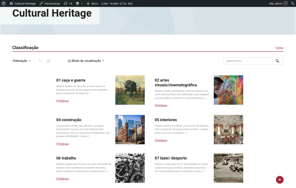
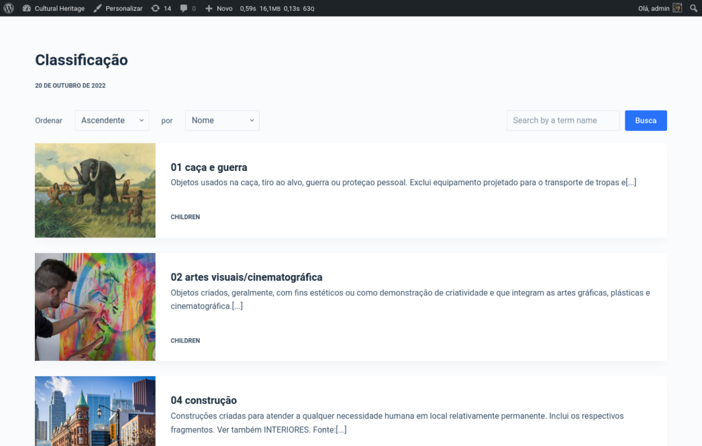
Each of the themes has different ways of viewing these terms, as well as display options. On each term card, you can see links to the list of items that use the term and to the child terms (when there are any), which is nothing more than the current term list itself filtered to show the child terms of a given term.
The list is also rendered in themes that do not support Tainacan, with a more traditional post listing layout. Several filters have been created to allow developers to change the layout of these lists, either via plugins or themes.
Taxonomy form refactor
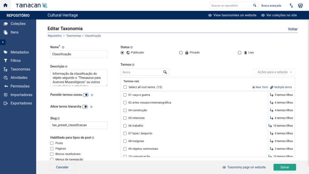
The taxonomy editing form has been given a new two-column layout with a fixed footer, similar to that of item editing. The idea is to condense the most important options on the left side and to make room on the right for the new term editing area, which was previously hidden in a tab.
We also have a new option: “Allow terms hierarchy“, which is active by default, but now enables terms to be configured without hierarchies, resulting in less complex linear views.
Multiple terms edition
The new interface that lists the Taxonomy terms on the form allows you to navigate through the hierarchy and choose multiple terms, either through manual selection at various levels, or through a full column selection (which includes all child terms of any term). As before, you can edit or remove them individually, but the interesting thing is that with more than one selected there are options for multiple removal or multiple editing of parent terms.
When attempting to remove terms, two options are offered:
- Remove only the selected terms – If any of these terms have child terms, these child terms will be “promoted” one level up the hierarchy, before their parents are removed;
- Remove selected terms and their children – Deletes the entire top-down hierarchy and the selected terms;
By changing the parent term of multiple terms, it is easy to manipulate entire branches of the hierarchy tree. you can swap parent terms or even set multiple terms as root. If there are child terms, they will remain children of the selected terms, changing their “genealogy” along with them.
Multiple terms insertion
The new interface also offers a special scenario for multiple insertion of terms, without the need to use a CSV importer. With the “Insert multiple” button, you get a term creation modal similar to the one in the Selectbox metadata configuration:
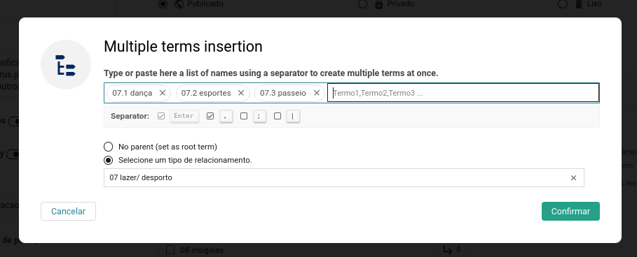
The text entry can be given several terms at once, interspersed with a separator of your choice, such as a comma or semicolon. The break will occur automatically when you paste the text.
Improvements
- Terms image loaded with different sizes in different contexts to improve the loading time of term listings;
- Respecting the maximum item limit constant (96 by default) in listings. This value is defined by a PHP constant and will now reflect better in several places in the interface. In the future this option will be available visually;
- Display the name of the metadata sections shown in the exported CSV;
- Clearer display of errors in the metadata sections form;
- Footer in the Collection form appears fixed, as in the Taxonomy and Item form;
- File name displays in the media gallery with forced line breaks;
Bug fixes
- Fixes problems when disabling repository level metadata or changing them from section;
- Fixed access errors on the item submission form;
- And many other bug fixes!
Themes
Tainacan Interface
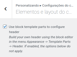
In addition to the templates needed to show the list of terms, the Tainacan Interface gets an advanced feature for those who want to further customize their header and footer. Now in the menu Customize -> Header Settings -> Header Elements and Layout, there is a new option to load the header from “template parts” made with blocks. In practice, this means that the header content will no longer be created and managed by the Customize Menu, but by the block editing interface we already know for editing posts and pages. You will find these settings under Appearance -> Template Parts -> Header.
As it can be seen in the video above, with this option you can create the entire header in the block editor, being able to take advantage of blocks such as the cover, social media icons, buttons, etc. The same can be achieved in the footer settings, opening up amazing possibilities for the Tainacan Interface, such as displaying Maps and various Logos in the footer.
In addition, this Tainacan Interface update also brings:
- Option to set the default sorting of “Items related to this one” on the Item page;
- Correction of color customization and iframe display issues;
Blocksy Support
Our plugin that integrates the Blocksy theme with Tainacan is already bringing the new term lists, whose layout can be configured in detail from the customize menu using the already known card options that the theme offers:
But the big news in this version is hidden in the settings of a collection item’s page. If before it was possible to show the metadata next to the media gallery or even the gallery below the metadata, now we can give even more prominence to the media, showing them in a strip above the title of the item, just below the header. This option also allows a background and text color setting for this new region:
In addition, this update to the Blocksy integration plugin also brings:
- Option to set the default sorting of “Items related to this one” on the Item page;
- Option to set the default display mode of the repository level item list;
- Blocksy 2.0.0 compatibility;
Get it now!
Version 0.20.3 of Tainacan is already available, as well as the latest updates for Tainacan Interface theme and the Tainacan Support for Blocksy plugin. You can download it or update directly from your WordPress panel:
