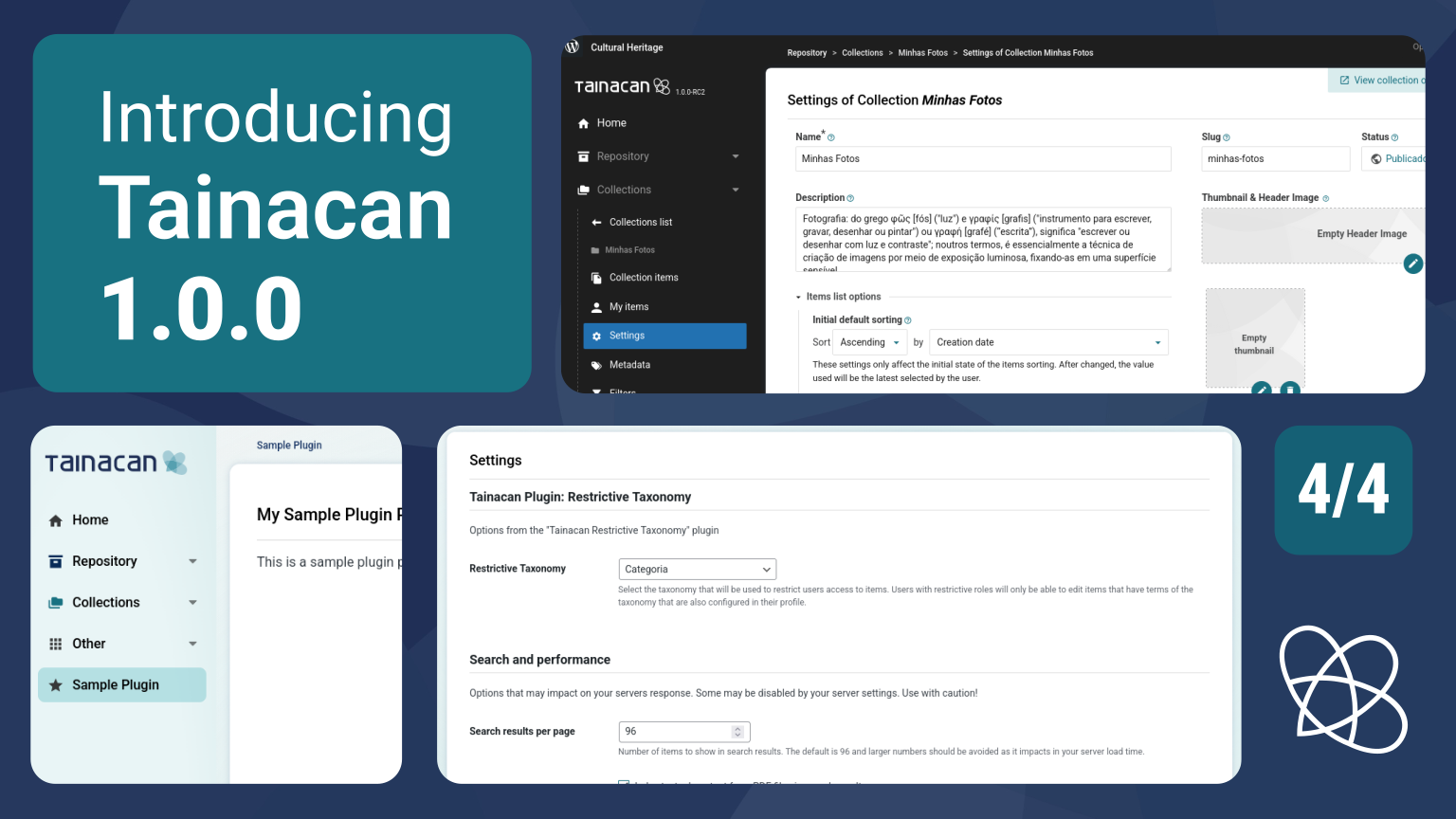
This is the latest in a series of four pre-release articles covering the new features in Tainacan 1.0.0. Be sure to read the other three:
- Part 1: New Admin UI and Dashboard
- Part 2: Plugin Settings Screen and Appearance Adjustments per User Role
- Part 3: My Items, “Items Related to This” Block, and Other New Features
- Part 4: For Developers
In this article, we will focus on the more technical aspects of the new version. More than just a redesign to modernize the interface, much of the effort to refactor the Tainacan Admin panel code was to allow for its customization and expansion by external code, in other words, plugins and/or themes that need to adapt Tainacan to a wide variety of scenarios.
Part of this was achieved by migrating a portion of the Tainacan Admin code from a Single Page Application (SPA) in Vue to a hybrid system between this same SPA and classes in PHP that reuse resources that WordPress has been offering for years to modify via Hooks (Actions and Filters). We already touched on some of the possibilities in the article about the new interface, but we will go over them here in more detail, in addition to presenting other cool things like our data selection components in React.
Conteúdo
- 1 Creating or filtering Dashboard cards
- 2 Creating pages in the Tainacan Admin
- 3 Creating options in the Settings Page
- 4 Registering admin appearance options per User Role
- 5 Using Tainacan selection React components
- 6 Conditionals in Entity form hooks
- 7 Customizing the Admin CSS
- 8 More extension possibilities
- 9 Wait, there’s more!
Creating or filtering Dashboard cards
The cards on the Tainacan Dashboard can be disabled by each user via Screen Options and can be hidden by default by Administrators via the user role editing form, as explained in in the article about the new interface.
But if you want to go ahead and forcefully hide some of our cards or even add your own cards, just filter the array $tainacan_dashboard_cards using the filter:
add_filter( 'tainacan-dashboard-cards',
   function($tainacan_dashboard_cards) {
      $tainacan_dashboard_cards[] = array(
         'id' => 'my-plugin-card',
         'title' => 'Cartão do meu plugin',
         ...
      );
      return $tainacan_dashboard_cards;
   }
);
The object inserted into the array must contain the fields id, title, description, content (a callback function with the core of the card), icon (an svg or img tag), color (gray, blue, or turquoise), and position (normal, side, column3, column4). If you have already ventured into the Dashboard Widgets API, WordPress will be right at home, since this array basically feeds the registration function of this widget with a few minor modifications on our part (such as the existence of the icon).
By default, your card will be visible to all users, and they will be able to hide it via Screen Options. If you want to make it hidden by default, simply modify the tainacan_dashboard_disabled_cards option using the WordPress options API.
Creating pages in the Tainacan Admin
One of the main reasons for refactoring the Admin navigation in version 1.0.0 was to provide an API that allows developers to insert new pages into the Tainacan Admin. To do this, we are once again expanding the WordPress menu API (add_menu_page), but adding some of our own conventions.
You can create pages that appear at the root of the Tainacan menu or pages that appear in the “Others” submenu. We have created a base class \Tainacan\Pages, which, if inherited with its methods implemented correctly, will allow your code to be integrated with our navigation system and visual identity.
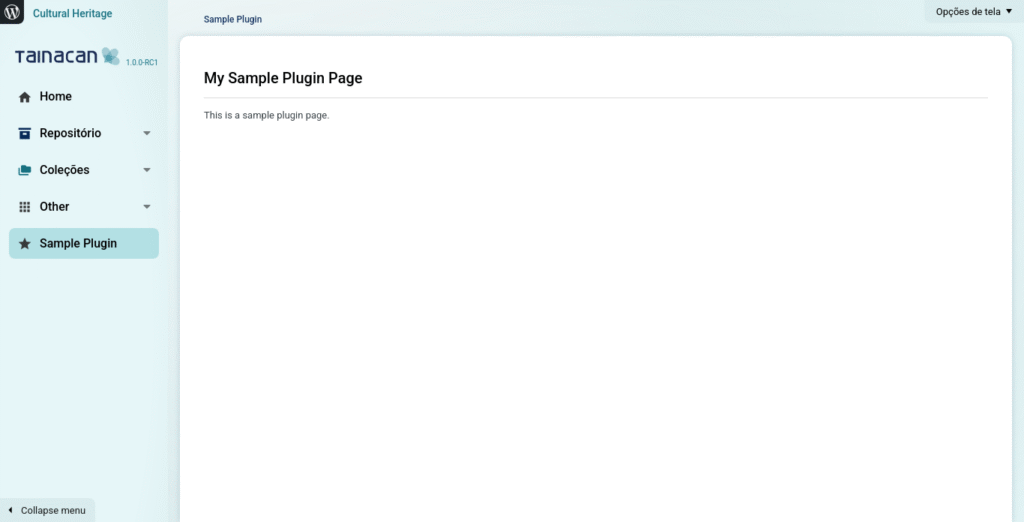
To help you dive into the possibilities of this new feature, we have created a demo code, a plugin that can be used as a starting point. Read the article on our Wiki for developers to explore the subject.
Creating options in the Settings Page
Perhaps your plugin or theme does not need an entire page in Tainacan Admin—maybe one or two extra settings will suffice. In this case, it is also possible to insert fields into the Tainacan settings form. Again, we are taking advantage of WordPress’s add_settings_field() and add_settings_field() API, which are called internally in our function:
\Tainacan\Settings::get_instance()->create_tainacan_setting( ... );With a few parameters, this function will generate the HTML within the plugin settings form, in addition to registering a wp option that can be easily consumed via get_option('tainacan_option_...). This way, users can have all the settings relevant to Tainacan and its complementary features in one place.
For a complete immersion in how to use this feature, read our dedicated page on the Developer Wiki.
Registering admin appearance options per User Role
The new “Admin Appearance” tab presented in another article allows you to set Boolean options per user role, generally aimed at hiding or modifying certain behaviors of the administrative interface. This form is built from an array called $tainacan-available-admin-ui-options, and you can modify it with the filter:
add_filter('tainacan-available-admin-ui-options',
   function($tainacan-available-admin-ui-options) {
      $tainacan-available-admin-ui-options['navigation']['items']['myAdminUIOption'] = __('My Admin UI Option', 'my-plugin-slug');
      return $tainacan-available-admin-ui-options;
   }
);
The array itself contains objects named for each section collapse you see in the interface, with fields such as label, description, and items. Within items, you can add a key-value option, where the key will be the option ID and the value will be its label. By default, any option in this array will be false.
Once this is done, your option will be present in the Admin by User Role appearance options form. However, for your option to be enabled, it needs to be present in the $tainacan-admin-ui-options array. If you want its default value to be true, simply insert it into the array:
add_filters('tainacan-admin-ui-options',
   function($tainacan-admin-ui-options) {
      $tainacan-admin-ui-options[] = 'myAdminUIOption';
      return $tainacan-admin-ui-options;
   }
);
Further down in the code, if you want to access the current value of the option, just call:
$this->has_admin_ui_option('myAdminUIOption')From inside any \Tainacan\Pages class.
Using Tainacan selection React components
If you are familiar with our Gutenberg blocks, you have probably noticed that many of them have a “selection step” where their configuration takes place. The most common is to open a modal where you choose the collection and then a set of items (or search criteria) to define what will be displayed in the block. We understand that this type of flow is something that can be very common in many scenarios. Imagine you are building a plugin to allow users to define their “favorite items.” You need to build a flow where people can list and mark items. Something that our REST API allows easily, but it is not very simple to deal with issues such as pagination and filtering.
With that in mind, we are exposing some of the React components we created for our Gutenberg blocks. If you plan to use them, we have written a detailed article on our developer Wiki explaining the process. Be sure to contact us on the forum for more details on how they can be used as well.
Conditionals in Entity form hooks
We call Form Hooks the “gaps” that exist in the Collection, Taxonomy, Item, Metadata, Metadata Sections, Terms, and User Role forms to allow plugins to insert extra options into these plugin entities. They have been around for a long time in Tainacan, and one of their possibilities is to define conditions for whether or not these extra options appear.
In version 1.0.0, we are evolving the conditional scheme so that not just one, but multiple conditionals exist. This way, if you want your extra option to appear only in Relationship Type Metadata that is from collection ID 1234, you can restrict this in the hook definition:
tainacan_register_admin_hook(
   'metadatum',          // Tipo de entidade
   array($this, 'form'), // Função callback que monta o formulário
   'end-right'           // Posição
   array(                // Conditionals
      'metadata_type' => 'Tainacan\Metadata_Types\Relationship',
      'collection_id' => 1234
   )
);
Learn more about Form Hooks in our dedicated Wiki article.
Customizing the Admin CSS
Como antecipamos no primeiro artigo desta série, está mais fácil de se customizar o CSS do Admin do Tainacan. Nós não consideramos que a customização ampla do Admin do Tainacan seja algo almejado por muita gente, mas entendemos que existem cenários, em acervos particulares, onde a mistura da identidade visual de outros sistemas da instituição com a interface do plugin pode ser desejada.
O melhor jeito de se entender o que é possível é inspecionando o navegador e dando uma olhada em nossas novas variáveis CSS. Veja a seguir o exemplo de algumas customizações feitas para se aproximar a interface do Admin da aparência do Editor de Sites do WordPress:
.tainacan-pages-container.tainacan-pages-container--admin-gutenberg-style {
    --tainacan-admin-background-color: #1e1e1e;
    --tainacan-admin-background-image: unset;
    --tainacan-admin-color: white;
    --tainacan-admin-link-color: #f0f0f1;
    --tainacan-admin-link-hover-color: white;
    --tainacan-admin-button-border-radius: 2px;
    --tainacan-admin-button-background-color: #1e1e1e;
    --tainacan-admin-button-color: #949494;
    --tainacan-admin-button-hover-color: white;
    --tainacan-admin-button-active-color: white;
    --tainacan-admin-button-hover-background-color: #2f2f2f;
    --tainacan-admin-button-active-background-color: #2271b1;
    --tainacan-admin-button-font-weight: 400;
    --tainacan-admin-navigation-sidebar-background-color: #1e1e1e;
    --tainacan-admin-navigation-sidebar-background-image: none;
    --tainacan-admin-navigation-sidebar-separator-color: #949494;
    --tainacan-admin-navigation-sidebar-floating-menu-background-color: #1e1e1e;
    --tainacan-page-container-border-radius: 8px;
    --tainacan-dashboard-card-border-radius: 4px;
    --tainacan-dashboard-card-border: 1px solid #e5e5e5;
    --tainacan-dashboard-card-box-shadow: none;
    --tainacan-input-border-radius: 2px;
    --tainacan-button-border-radius: 2px;
    --tainacan-dropdownmenu-border-radius: 4px;
    --tainacan-modal-border-radius: 4px;

    #tainacan-page-container {
        #tainacan-navigation-menu a,
        #tainacan-navigation-menu a .icon,
        #tainacan-navigation-menu button .icon {
            color: var(--tainacan-white) !important;
        }
        #tainacan-navigation-menu .menu-item-has-children button::after {
            filter: invert(1.0);
        }
    }
}
.tainacan-pages-container--fullscreen.tainacan-pages-container.tainacan-pages-container--admin-gutenberg-style {
    --tainacan-admin-navigation-sidebar-width: calc( 300px - var(--tainacan-page-container--inner-padding-x, 1rem) );
}
Would you like to use a white version of the Tainacan logo in the sidebar?
add_filter( 'tainacan-navigation-logo-use-white', function() { return true; });How about changing the Dashboard logo and welcome text?
add_filter( 'tainacan-dashboard-logo', function() { return '../logo.svg'; } );
add_filter( 'tainacan-dashboard-welcome-message', function() {
    return __( 'Este é a sua tela inicial de gestão do acervo...', 'my-plugin-slug' );
} );
More extension possibilities
Interested in modifying or expanding Tainacan in other ways? Did you know that you can register your own metadata types and visualization modes? This and other topics are explored in more detail in our developer documentation.
Wait, there’s more!
Be sure to read the other articles covering the new features in the 1.0 release: