This is the first in a series of four pre-release articles covering the new features in Tainacan 1.0.0. Be sure to read the other three:
- Part 1: New Admin UI and Dashboard
- Part 2: Plugin Settings Screen and Appearance Adjustments by User Role
- Part 3: My Items, “Items Related to This” Block, and Other New Features
- Part 4: For Developers (soon)
In this article, we will present the main new features that you will discover right away in Tainacan 1.0.0. These new features were made possible thanks to a considerable refactoring of our code, seeking to provide greater extensibility by third parties, in addition to fulfilling long-standing requests from the community. After more than a year of refinement and even some evaluations with users, we are confident that we have arrived at a much more mature, flexible, and powerful Tainacan worthy of version 1.0.0. We would like to give special thanks to Luiza Peixe, from Cardume, for her incredible work and support in creating these screens.
Conteúdo
An Admin Screen Native to WordPress
Once you update your plugin to version 1.0.0, you may notice a small difference: the plugin link is now higher up. Previously tucked away at the bottom of the WordPress Admin link list, we have now promoted the plugin to a position just above your Pages list. We consider this important because Tainacan is not merely a tool for customizing your WordPress site, but is essentially a content manager.
But the first major change to note is certainly in the admin’s appearance. For starters, the plugin no longer hides the WordPress administrative interface; it appears, as other plugins usually do, within it.
We did this so that users remain aware that they are in the WordPress administrative context, offering easy access to other relevant options that are not managed within Tainacan, such as your Profile (in the upper right corner) and your pages, media, and posts.
We know that this will certainly take more accustomed users by surprise. But don’t worry! This behavior can be configured.
Each user can access “Screen Options” in the upper right corner and click “Hide WordPress navigation” in the “Integration with the WordPress Admin UI” field:
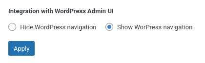
This information will be saved as a user preference, and the Tainacan screens will only display the WordPress menu and bar again if the user reconfigures this option. If you want this to be the default behavior for all users, we will mention in another article how to customize this by user role.
Some people may call this a “full screen mode.” We find this terminology easy to learn but somewhat confusing, since the entire website can be put into full screen mode by the browser using system shortcuts.
With the plugin in this mode, it is still possible to return to the WordPress Admin panel. However, unlike previous versions, this link is now in the upper left corner of the screen instead of the right corner. We did this to maintain consistency with other screens that adopt this behavior in WordPress, such as the block editor (Gutenberg).
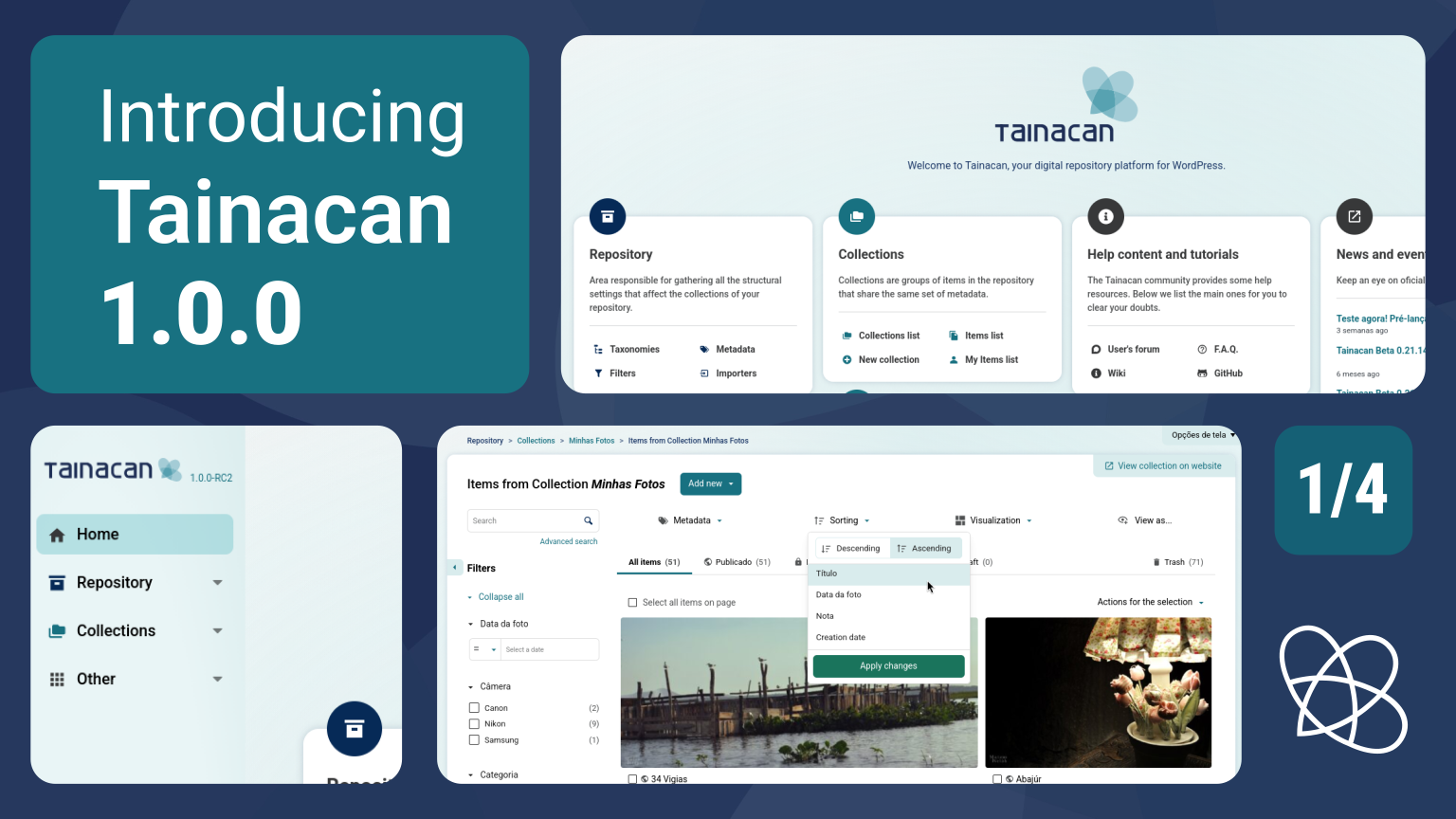
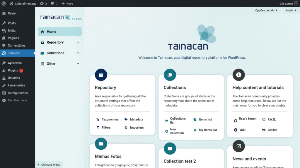
Tainacan Dashboard: your new plugin Admin home screen
When you access the plugin screen for the first time, the big news will be the Admin home screen. Here’s a before and after comparison:
Unlike our old rigid cards, this new interface offers greater flexibility:
- Cards are collapsible and sortable: each user can decide which links have the highest priority on their home page;
- Cards can be hidden: if you are not interested in seeing a certain card, go to “Screen Options” in the upper right corner. There you will find a list with a checkbox for each card;
The cards were created using the same API that generates WordPress Dashboard Widgets, so if you are familiar with them, you will feel right at home. We are also reorganizing the links, highlighting what we consider most important and introducing some new features:
- The side menu will be available from the home page, allowing immediate navigation to locations not available via cards.
- The repository area, which is usually accessed less frequently and has greater importance only to administrators, will be less prominent, concentrated on the first card.
- For each collection created, a new card will be created with links to it. Previously, only a limited number of collections were loaded, which frustrated managers with multiple collections.
- There is a dedicated card for educational content, offering direct links to our Wiki and our User Forum.
- There is a dedicated card for release posts like this one, to ensure that users are always up to date with the latest news.
- Given the absence of collection images in some scenarios, we are reducing the presentation of images and giving more prominence to iconography, reinforcing the visual navigation cues on the side.
Want to define which shortcuts appear on cards and which cards appear by default for a certain type of user? We will mention in another post how to customize this by user role. But the most important thing about this new screen is that developers can create their own cards via code, empowering future plugins and themes to register information that is immediately accessible on the user’s home screen.
In previous versions, there were three different ways to navigate Tainacan Admin screens:
- The floating menu that appeared when hovering over the Tainacan link, which gave access to Reports, the System Diagnostics screen, User Roles Management, and Item Submission Options;
- The repository level menu, the dark blue side area that appeared on internal admin pages;
- The collection level menu, the turquoise blue area that appeared horizontally under the collection page sections.
Although many of us have learned to get used to this composite navigation, we consider it to be a significant barrier for new users. In this version, we are unifying all these accesses into a single side menu, closer to how the navigation of the WordPress admin panel itself works.
Here are some highlights about this new organization:
- The List of Collections and the List of All items in the repository have been removed from the Repository section and moved to a “Collections” section. We did this because we believe that this is where the heart of Tainacan item editors’ operations lies. Most users do not edit repository-level settings on a daily basis; this is more common for experienced managers. Immediate access to the collections screen or even the list of items is therefore prioritized in this menu. It is also a dynamic menu, which changes its links when a user clicks on a collection. You will also see links to the new “My Items” screens… we talk about this feature in another article.
- The Process List, which shows the status of import, export, and bulk editing processes, was previously accessible via a button in the upper right corner. This button took you to the Repository Activities screen, with the “Processes” tab selected. We decided to promote this list to a dedicated page, which can be accessed in the “Repository” -> “Processes” section of the menu.
- The Reports Page, which was located in the plugin’s floating submenu, had a selector to choose whether to view Reports from the Repository or from each Collection. We have migrated this to the navigation. Repository Reports are now accessible directly in the “Repository” -> “Reports” section. Reports for each collection will be where you would expect them to be: in the “Collection X” -> “Reports” menu, once the collection has been selected, of course.
- The “Other” menu remains as the space dedicated for administrators who wish to make changes not only to the repository data, but also to the behavior and functionality of the plugin. It includes the new Plugin Settings screen (which we will discuss further in a dedicated post), the User Profiles configuration area, and the System Diagnostics screen.
As with the old side menu, this menu can be collapsed to free up horizontal space. In this case, the submenus become floating panels that open with a click.
An important detail is that when the plugin is in “full screen mode,” two essential links are also visible in the sidebar: one that returns to the WordPress admin and one that takes you to the public site.
Finally, refactoring this menu allowed us to create a structure that internally reuses the WordPress submenu system. What this means in practice is that developers will finally be able to register new menus and submenus to appear within this system, allowing plugins and themes that complement Tainacan’s functionality to be placed “at home.” We have documentation ready on the Wiki about how this will work.
Evolving Tainacan’s visual identity
After so many years of project, we are very proud of the visual identity that was created for Tainacan. But in a scenario that changes and evolves as quickly as Web Design, a revamp from time to time is inevitable. We are moving away from a more minimalist and solid interface to a more expressive and interactive one. With this small redesign, we are incorporating some modern aspects that we have identified in both the newest WordPress components and other systems, while still respecting the defining principles of the Tainacan brand and the look of the screens that you may be used to in recent years.
On the Dashboard page, you will see more emphasis on the Tainacan brand and colors, welcoming users who are experiencing the collection management screen for the first time.
With the concentration of internal navigation features in the new unified side menu, we display the rest of the pages in a sort of “shell” canvas. This is a very common visual pattern nowadays and can be seen in interfaces such as WordPress itself (pattern screen and site editor), Slack, Google (Gmail, Drive), and Discourse (yes, in our forum!).
In addition, in the new Tainacan Admin Panel you will see:
- Improved responsiveness for mobile screens.
- More rounded edges;
- Larger buttons, text input fields, and checkboxes;
- Use of shadows and light outlines in more places;
- A visual standardization of the positioning of modal close buttons and their background color;
- A greater presence of headers and fixed scrolls on various screens, reinforcing the context, as well as more fixed footers in forms;
- Clickable cards with refined dimensions and interactions in the lists of importers, exporters, and exhibitors;
- Improved responsiveness for mobile screens.
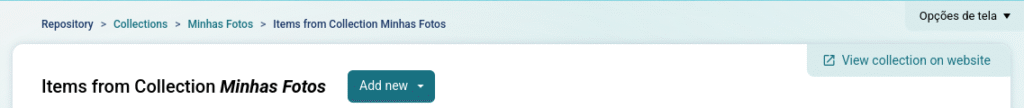
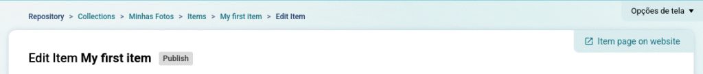
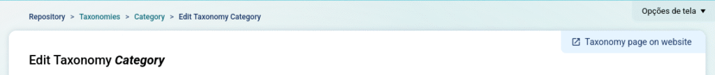
One highlight is the presence of “External Access Links” on several screens. These links will always be located in the upper right corner of the white area of the page, providing quick access to the public version of whatever the user is accessing on the website. Some of these links already existed before, but were confusingly located in footers, subtitles, or other areas of the page.
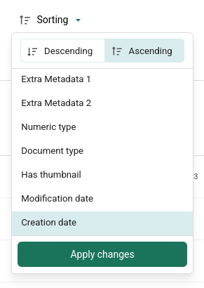
Another highlight cannot go unnoticed. You will see a new “Sorting” button in the listings that will open a single popup to change the Sorting Direction and Sorting Metadata. Previously, we had a separated select for each of these.
This is the visual standard adopted in modern WordPress DataViews components and allows search control bars to have a fixed size that does not vary depending on the selected metadata.
We consider this new unified form more interesting and intend to offer it in Tainacan’s public listings in the future.
And of course, like everything we’ve presented so far, this redesign also allows us to offer greater customization for developers. This means that plugins or themes that want to change visual aspects of the visual identity will now have a much easier path, thanks to the intensive use of CSS variables.
We don’t believe that extensive customization of the Tainacan Admin is something that many people want, but we understand that there are scenarios, in private collections, where mixing the visual identity of other systems in the institution with the plugin interface may be desirable. We are delegating this to code settings, but we have prepared some examples that serve as proof of concept, where changing the logo, color palette, and other aspects of the visual identity become possible with a few lines:
Wait, there’s more!
Be sure to read the other articles covering the new features in the 1.0 release:
- Part 1: New Admin Interface and Dashboard
- Part 2: Plugin Settings Screen and Appearance Adjustments by User Role
- Part 3: My Items, “Items Related to This” Block, and Other New Features
- Part 4: For Developers (soon)