Our release cycle is changing its profile a bit, as we try to accumulate less news in major releases and promote the release of more versions with a smaller – but no less relevant – amount of changes to Tainacan. Past two minor releases with fixes from 0.18, we can’t have the same discretion with the arrival of version 0.18.3, which brings some interesting tweaks to the item edit page and introduces us to a new concept that should improve the use of relationship metadata.
Conteúdo
Refactored Item Page
In Tainacan’s administrative panel, certainly one of the most relevant screens for the collection manager is the Item Editing screen (and its twin sister, the item page in the admin). We have planned, for this and the next versions, some design adjustments that should provide a better understanding of all the features that are available there.
Focus on the metadata!
We start by swapping sides, where the metadata column is now on the left and the document column is on the right. This change aims to prioritize the item’s metadata in the reading order. In addition, we now keep the document and thumbnail fixed with the screen scroll, avoiding the unused blank space that was seen there when the list of metadata was too long:
Easy access to metadata at the bottom
Sometimes there is so much metadata that it is hard to get to the end of the list and find the field you are looking for. So, just like we did for the list of metadata on their page, we now have a textual filter to search the metadata more easily by its name. A useful tool for those who have at their fingertips which field is missing 😉
Text entry with previous suggestions
Plain text metadata, such as the Core Title, will now have a new setting available called “Enable Suggestions”. With this setting enabled, when typing any term in the text entry field, terms already used in that metadata will be suggested in other items. This enables the use of a “semi-controlled” vocabulary, where, unlike taxonomies, we do not have a specific set of terms to choose from, but can decide to use terms already entered, if they exist. It also may also help if, on the other hand, you want to make sure that you are entering a new term rather than something very similar that has already been placed in another item.
Not only on the item page, but throughout the Tainacan interface in general, it is common for long labels, such as those for large metadata names, to end up ellipsed in the interface (i.e., cut off at a certain character limit with “…”). Despite the visual appeal this brought, it was constantly a source of frustration for those who needed to give their data longer names. So we are removing these ellipses from most forms, allowing labels to have more than one line if necessary.

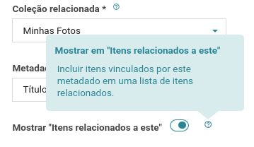
The relationship type metadata is the tool we have to create a link between a certain item and another. For example, we can have in a Works collection, a metadata named Artist that points to an item in another Artists collection. Whoever starts from the Works collection will easily fall into the Artists collection with the links from the metadata… but what about the other way around? One can of course create a relationship metadata in the Artists collection, but this manual filling in can become tedious. So now we have a new configuration for the relationship type metadata. Just go into the options of the metadata that describes this relationship and enable the option to ‘Show in “Items related to this one”‘.

Now, accessing the item’s page in the admin panel, we have a new tab “Items related to this one”, which shows which items have tagged this item in some of their own relationship metadata. The listing is segmented by collection and by metadata, and provides links to get to these items. If you are on the edit page and have sufficient permissions, you can even open a modal and edit the item, changing any of its information, including the relationship itself.
More consistent Status
The relationship between WordPress statuses and the visibility of an item in Tainacan is always a subject of discussion among our users and certainly demands interface improvements to achieve better clarity. We are bringing some changes in this regard, aiming to reduce confusion:
“All the items” – or almost all of them
In the admin panel items listing, we have dedicated tabs for each of the four statuses “Public”, “Private”, “Draft” and “Trash”, plus a home tab that aggregates “Public” and “Private” at once. The confusion already starts with the “Published items” label on this tab, since being “Published” does not necessarily indicate that anyone can see an item.
Itens may be published in a public or private way, this is where the concept of “Visibility” comes in, which is affected even by more issues, such as the visibility of the collection itself, where the item is.
In addition, there is constant annoyance from some users who do not see their draft items included in this summation, since they may be in the process of being reviewed, but are still items.
The “Draft” status indicates a stage of publication elaboration, something that is being done. The “Trash” status, on the other hand, effectively points to discarded items, that possibly will never be used again and in the future should be removed permanently.
So, after considerable discussion, we agreed to make this first tab, the “All items” tab, removing the confusion of the term “published”. We have therefore added the “Drafts”, but kept the “Trash” out of the count.

OK, and which is the status of this item?
Given that a tab like this now has so many different status types, it is clear that we need to know, at least in this context, which status this item is in. Therefore, as a visual enhancement, we have added the status icon in the tabs of listings with more than one status. This also applies to collection listings and taxonomy listings.
Making Submission Forms Clearer
We also have one last new feature, for the Item Submission Block introduced in version 0.17. In order to make item forms a little less visually cluttered, we now show the help buttons (those circles with question marks next to the labels) only in cases where some description has been created for the metadata. This prevents your form from having several little balloons with phrases like “Description not provided”.
If, instead, you want to show the metadata description more explicitly – explaining in more detail, for example, how to populate that metadata – we have created a new option that allows the descriptions to appear just below the metadata label, in a slightly more unobtrusive font size:
Some performance improvements
Less requests to the facets
We have considerably reduced the number of queries made to the bank in the item listing when performing operations that require reloading the items, but not the filter facets, such as when changing pages, changing the search order, or even the view mode.
More efficient dependency loading
Finally, a more technical issue. We continue investigating ways to make the plugin more efficient. This time we optimized the way the code related to the Gutenberg blocks is loaded so that it only loads on the necessary pages, reducing the loading time of pages overall and also avoiding style conflicts.
Get it now!
Tainacan version 0.18.3 is already available. You can download it or update directly from your WordPress panel:


