Conteúdo
Hello community!
After a few weeks full of news, with new versions of the Tainacan plugin and the Tainacan Interface theme, as well as announcing our new discussion forum, we have some more good news for you.
As we explained in our Wiki, Tainacan generates some special pages in your WordPress, which requires developers to make adjustments to make a theme “compatible” with these screens, taking full advantage of all the features that the plugin offers. These adjustments are usually done via child themes or plugins, such as the one we’re going to present today.
In order to extend the use of Tainacan to more and more users, we’ve search for a theme that has an increasing popularity and allows you to configure your site for the various customization demands that we usually receive. This is how we found Blocksy.
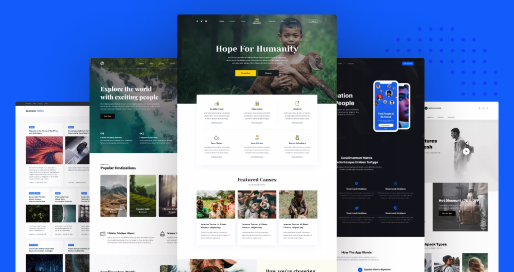
With over 20,000 active installations and extremely positive reviews in the WordPress theme repository, Blocksy really is a very powerful theme. It already comes with an attractive and modern design, and is extremely fast and responsive. But its real value lies in the effort made by the developers to augment the WordPress “Customizer” menu (the theme’s customization panel) with rich and advanced controls for easy adjustment of the various settings available.
Colors, typography, layouts in general, everything is accessible in the smallest details so that the site can be customized to the maximum without having to mess with code. Also, different settings can be made for certain types of pages and posts… which is good news for Tainacan.
Tainacan Support for Blocksy
By searching for “Blocksy” or “Tainacan” in the WordPress plugin repository, you will easily find our new plugin:
Having this plugin active, in addition of course to the Blocksy Theme and the active Tainacan plugin, your customize menu will offer a number of new settings to customize your items listing and collection item pages. Let’s break it down:
Different settings for each collection
The first big new feature of this integration is that you can have different settings for different collections. Imagine having, for example, one background color for an Albums collection and another for a Photo collection? What about an item page with more highlights for metadata and another one with more highlights for attachments?
Thanks to Blocksy’s feature of having a configuration for each post type, you will see in the customize menu a panel for each of your collections, plus, further down, a panel for the repository-level and taxonomy term-level item listings.
For each collection, there are actually two panels: the item listing (archive) panel and the item page (single) panel.
Items listing options
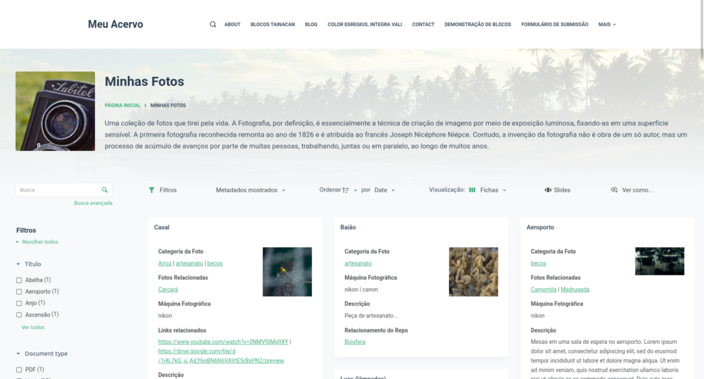
The item lists in Blocksy initially look a little different from what we usually see in the Tainacan Interface. The background image of the collection is now at the bottom of a box, serving only to adorn the session. The thumbnail image, on the other hand, is square and has greater prominence. The box with the list controls is connected to this header and the items and filter panel have their own background color:
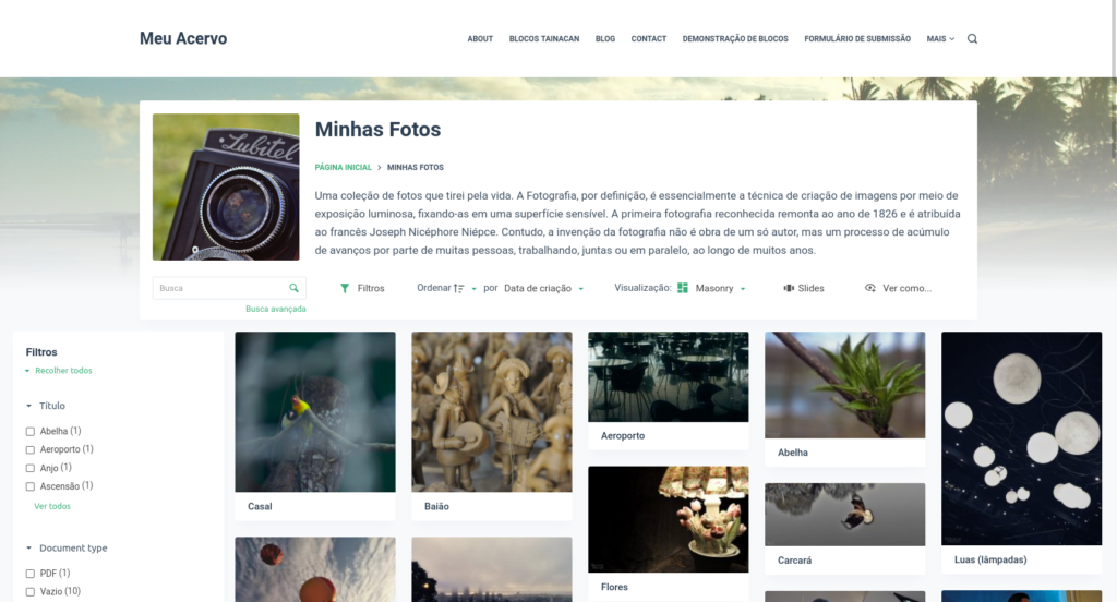
So let’s dive into the customize menu options for this listing. At first you will notice at the bottom of this panel the color palettes. These are divided into two groups: one for background colors and another for text. We have already left three palettes ready for you to use: the light (default), the dark, and a sepia one. But if you want to choose your own colors, just click on the little balls and change. To get a sense of what is changing, here is a short summary of where each color is usually used:
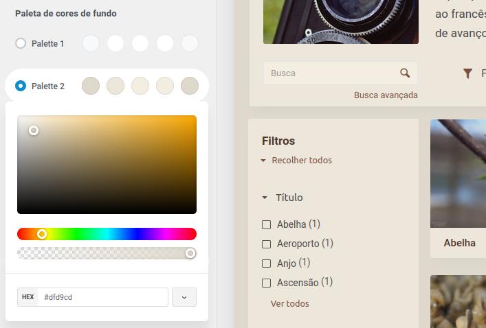
- Color 1 – Background color of the page as a whole;
- Color 2 – Background color of the “blocks” or “cards”, such as the items, filter panel and header box;
- Color 3 – Background color of items when you hover the mouse over them;
- Color 4 – Color of the forms and input fields in general;
- Color 5 – The secondary, lighter color of the color palette, used in tooltips and other prominent elements;
And in the text color palette:
- Color 1 – The main color of the palette, used to highlight links, icons, and active elements;
- Color 2 – Color of the headers, such as the “Filters” section and modal titles;
- Color 3 – Color of the form’s labels;
- Color 4 – Color of lower-weight information such as non-primary metadata;
- Color 5 – Color of text in the editable fields of the forms;
In addition, we also have specific settings for the items listings, already known to Tainacan Interface users, such as the size of the filter panel, whether it should be displayed or not, the presence of pagination or not, how the viesualization modes will be offered, etc…
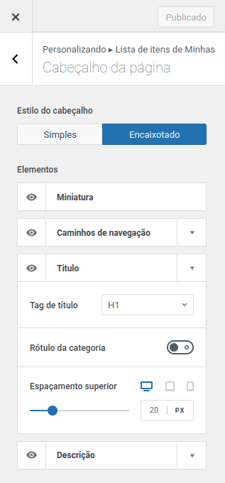
But it doesn’t stop there, you can also edit in the first session the elements of the listing header, such as the presence or absence of a Collection description, navigation paths, and even the style of the box where this information appears.
What about the Repository Items and Taxonomy Terms pages? Don’t worry, they also have a space for their own settings, just below the collections options.
Single Item Page Options
Regarding the item page, the options are even more varied. Going from the bottom up, we have some interesting settings that Blocksy offers for posts that can be desired here:
- Display “Related Posts”, i.e. items that share some taxonomy or are in the same collection as the current item;
- Display the “Posts Navigation”, in this case the next and previous items, according to the context of the search you came from;
- Display the “Share Box”, with various settings that can be made to share your item on more than 13 social networks;
- Various options for alignment, spacing and page layout;
- Various ways of displaying the page header, including using the featured image in an attractive banner.
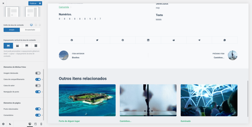
But more importantly, we have some item page specific settings that give even more flexibility:
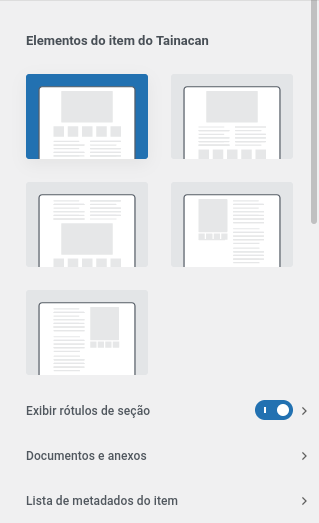
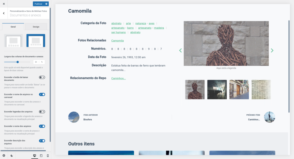
Item Layout and Content
With a simple selector, you can now choose between three ways to display your sessions:
- In one column, Document, Attachments and Metadata;
- In one column, Document, Metadata and Attachments;
- In one column, Metadata, Document and Attachments;
- Two columns, the first with Documents and Attachments and the second with Metadata;
- Two columns, the first with Metadata and the second with Documents and Attachments.
Session Labels
All session labels such as “Document” and “Metadata” can be edited, as well as having the alignment and font style set. If these divisions don’t make sense for your item, just disable it and they’re gone!
Main Document and Attachments
If you have chosen to display the item content in two columns, here you can decide how much the document column will occupy. You can also choose to display attachments and integrated document in a single carousel, just like Tainacan Interface’s “Gallery” mode.
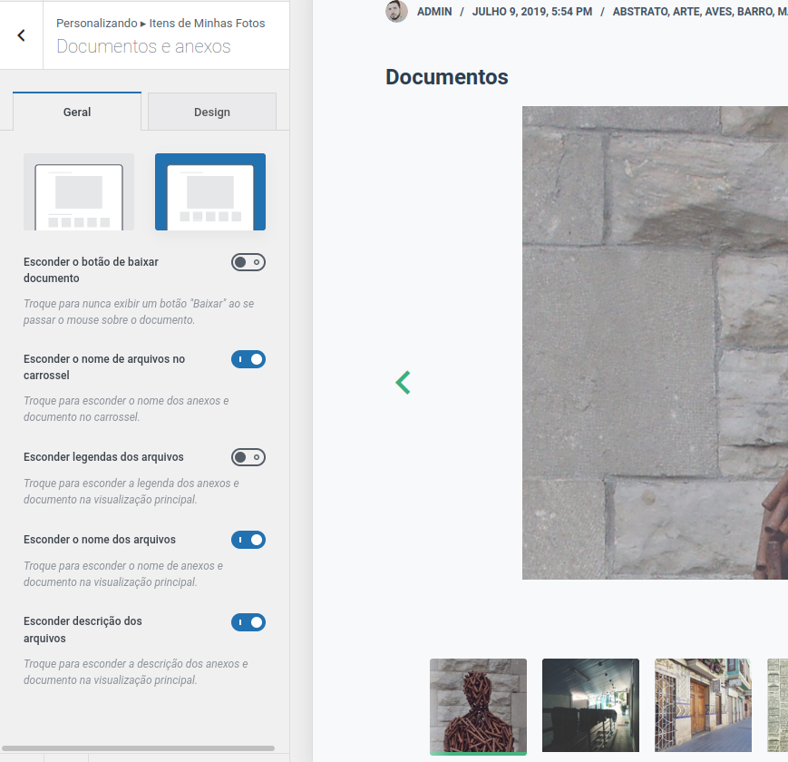
The plugin also takes advantage of the new media component, introduced in Taiancan 0.18 to give diverse options of whether or not to display title, caption, and description of the images, and to configure the size of the thumbnails of the items in the carousel in the “Design” tab.
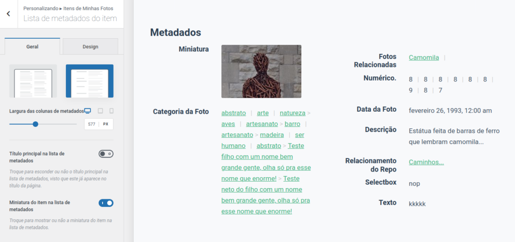
Item Metadata List
Finally, several adjustments can be made to the list of metadata. Besides the well-known possibility of setting the size of the columns (and consequently how many columns will appear, in each screen size), we can set the size and font size of the metadata labels and values, their alignments, and two ways of displaying this information:
- Metadata with labels above their values (the default);
- Metadata with labels aside their values;
This brings us to page presentations of items never before imagined for Tainacan:
And how about Tainacan Interface?
Don’t worry, we will continue to maintain and bring new features to the Tainacan Interface. The idea is that more and more themes will be available for Tainacan users, trying to please all tastes. Keep an eye on this blog for other news.