Conteúdo
- 1 New features
- 1.1 Metadata displayed in the relationship
- 1.2 Editing a relation directly from the item
- 1.3 Metadata edition modal
- 1.4 Limit the amount of multiple metadata values
- 1.5 Creating new terms via item submission form
- 1.6 More options for the Document type URL
- 1.7 Color text for Tainacan Blocks
- 1.8 New features for the carousel blocks
- 1.9 Select Items Manually in the Dynamic Item Block
- 2 Improvements
- 3 For developers only
- 4 Themes
- 5 Get it now!
The release cycle of version 0.18 is reaching its end with another package of good news. In fact, this time there are so many that they barely fit in this article! In addition the new features introduced in version 0.18.3 for Relationship type metadata, this release increases its functionality. We also bring a number of usability improvements for editing metadata in general, new filter tags, new settings for the Document URL type and important options for customizing your Gutenberg blocks.

New features
Metadata displayed in the relationship
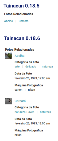
Establishing a relationship between one item and another is a simple process of searching for the title of the item and entering it in the list of values of a relationship metadata. Often, however, that title does not tell us everything we would like to know about this relationship. Sometimes we want to know more about the item without having to go to the its page. To do this we created a new configuration for this metadata, which allows you to define which metadata should appear in the value, besides the title itself. This opens the way for us to show information such as the photo, date of birth, and gender of a particular author, for example, in a book item.
The new feature, of course, also required improvements in the relationship input field, which now has more information and a tab to show the list of selected metadata, since the old taginput seemed to be unable to handle so much detail.
Themes have also received updates to be able to display this new type of metadata value correctly on their item pages. If you don’t like this new display and prefer the old classic link list, don’t worry, just keep the search metadata as the only marked for display.
Editing a relation directly from the item
And in the wake of these changes to the relationship input field, we can now, in the selected items tab, easily change the relationship from the current item. We can for example remove an item that no longer fits there, or even directly edit this item by opening a modal similar to the one that allows the creation of new items from the item form.
Metadata edition modal
With so many new features coming to the metadata, we realized that the metadata editition form needed an overhaul. Instead of opening so many options in an expandable panel, we moved the form to a modal window, where we could organize the options into categories, giving more room for future features (hello metadata sections…)
Limit the amount of multiple metadata values
Speaking of new features for the metadata, all of them can now limit the amount of multiple values they will have. Finally, if your metadata accepts more than one value but no more than three, you can have this set in order to not pollute your items with too much information 😉
Creating new terms via item submission form
Those who have been using our Item Submission block know that not everything we do in the administrative side can be done there in the public side. One of these limitations was the creation of new terms in the submission flow, which is now allowed, with a small exception: you can only create terms whose hierarchy already exists, that is, if you define a parent term, it must already be created.
More options for the Document type URL
When we limited (for security reasons) the insertion of HTML into text fields in version 0.18, some more adventurous users missed the possibility to use a text document to show external content embedded in the page via iframes. The time has come to introduce a better way to do this. Using the document type URL, we can place the link to the external content that we want to display and with the new settings, choose to display this content inside an iframe instead of just a link.
It may sound strange, but it is worth remembering that this was already happening with links that WordPress can embed automatically, such as YouTube videos (see the full list here). There are a few notable cases we can mention:
- Link to Google Maps, for displaying places:
- Public links to Google Drive, for showing previews of documents, even images:
- Links to public images:
Note that in all of these cases, your WordPress database is only storing the links, and the content shown is being fetched externally, from its source. Unfortunately, this solution will not allow you to embed any links, as security permissions can be applied to the source to prevent embedding.
Color text for Tainacan Blocks
Moving on to the world of blocks, who has never wanted to put a list of terms or items in a banner with a dark background, but gave up when they saw that the names would become impossible to read? Well, no more of this restriction, now most of Tainacan’s blocks allow you to configure the text color of the blocks:
When used within blocks that have their own color settings, such as the Cover, the block will automatically inherit the suggested color.
New features for the carousel blocks
In order to give more versatility to our three carousel blocks, we are also introducing three new options for them:
- Adjust the space between carousel items;
- Adjust the space around the carousel items;
- Change the style of the arrow used in the block;
Select Items Manually in the Dynamic Item Block
There are four ways to display items via Tainacan blocks:
- Using the (static) item block for manual selection;
- Using the dynamic item block with a configured search;
- Using the Faceted Search block, which shows the list with filters and everything else;
- Using the carousel items block, either applying a search or with manual selection of items;
The first two should have similar features, but the second has been gaining more prominence, since its item loading strategy is more intelligent than the first block. This has caused us to slowly recommend its use and add more features to it. So today we are finally giving it a checkmate with the introduction of the manual item selection feature (very similar to what happens in the carousel block), so that this block can meet the possible needs that the static item block covered. The idea is that soon you will no longer be able to use the legacy static block.
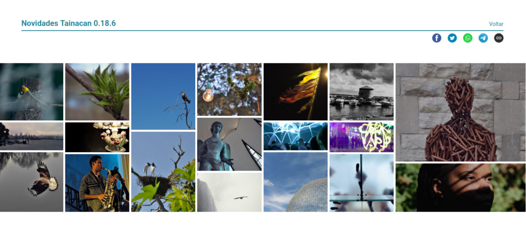
And to take advantage of this block, how about playing with its new “Mosaic” view mode option? You can now use the grid in 6×2 groups:

Improvements
Whenever we see a list of items with various filters applied, there is that mental confusion: well, from which filter did this tag come from? What can sometimes be obvious gets confusing in complex searches, which motivated us to redesign the list of tags, bringing a little more information to it:

The new list now shows the name of the metadata above the applied filter value. We have also moved the “Clear filters” button to be next to the total filters applied information, reinforcing the relationship of these elements.
Finally, as a responsiveness improvement, where these tags were previously stacked when there was no more screen space, we have now created a small horizontal carousel to keep them all in one line.
Adjustments to input fields with multiple checkboxes

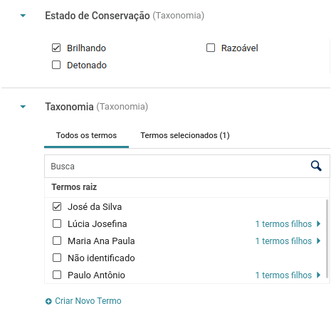
In the later versions, we have been increasing the “checkbox/radio list” input fields, used in particular by taxonomy metadata. These lists have two tabs, to show available and selected options, and are designed to accommodate complex data structures with hierarchy and hundreds of terms. But if your controlled vocabulary boils down to a simple “Yes” and “No”, it feels like we are hitting an ant with a cannon!
So if this is the case, here’s a tip to have a more basic input: In the metadata configuration, choose the option “List of options always visible”. This will cause the possible metadata values to load right away when entering the item edit page. If your taxonomy has fewer than 50 terms and none of them have a child term, the interface shown will be simplified, with only the checkboxes and no tabs or search field.
Forcing the image crop on items carousel
A few months ago, we created an option to force image cropping to square-shaped items in the items carousel block. However, this option was automatically disabled if you chose to show fewer than 5 items per row in the carousel. That was because with 4 or less items per row, the carousel images would need to be larger and there is no cropped version above a certain size in Tainacan. If you still want to force this cropping, we are finally making the adjustment in the block itself, centering the images and stretching them according to their proportion.
And more…
- Items, collections and terms in gutenberg blocks now open in the same tab, instead of a new one.
- Improved search efficiency;
For developers only
- New tainacan-blocks-facets-list-update event that allows you to change multiple facet blocks at once in a single search bar;
- Updated most blocks to the Gutenberg apiVersion 2.
Themes
And of course, both the Tainacan Interface theme and our Blocksy theme support plugin have received updates with minor fixes and minor new features:
- Compatibility with the display of metadata in the new relationships;
- Document download button is no longer shown in contexts where it does not make sense (as in the case of texts);
- Option to disable the media gallery completely, if it is not desired (e.g. for collections that do not have documents of type Image);
- Light color scheme in the media gallery:
Get it now!
Tainacan version 0.18.6 is now available. You can download or update it directly from your WordPress admin panel:
