Conteúdo
- 1 What’s new
- 2 Improvements
- 2.1 Advanced Search Refactoring
- 2.2 Reorganization of the Item Editing Screen
- 2.3 Rethinking the Update Button and Status
- 2.4 Metadata Navigation Focus Mode
- 2.5 Required Metadata Filter
- 2.6 Reorganizing the Collection Editing Screen
- 2.7 Metadata Description and Placeholders
- 2.8 Relationship among Draft Items
- 2.9 Filters that “Start Disabled”
- 2.10 New image size: tainacan-large-full
- 2.11 Masonry View Mode with Larger Images
- 2.12 Image Size Option in Tainacan Blocks
- 2.13 And much more!
- 3 For Developers
- 4 Get it now!
It seemed like a lifetime, but after much waiting, the metadata sections have finally arrived in Tainacan! This release starts the 0.19 cycle focusing on this feature, but also brings some important improvements and refactoring that will make the plugin ready for what we believe, will be our last big step before 1.0.
What’s new
Metadata Sections
From the very first Tainacan use case, it was clear to us that digital objects would not be limited to being described by one, two, or even five metadata only.
The potential of Tainacan is precisely in this flexibility that gives you tools to describe an item with 10, 20, sometimes almost a hundred metadata. The problem with this is that the list of metadata for an item tends to grow a lot, so that when displaying it to the public we often have… well… a cascade of text.
To allow better grouping and separation of all this data, we have created the Metadata Section, a new level in the information hierarchy of your collection.
By default, all existing metadata will already be contained in a “standard” section named simply Metadata. In the Metadata Edit screen of your collection, you can create a section using the new button available below the metadata types. Note that it can also be dragged and dropped to the left side.
The section can have a name and description that will be seen in the item edit screen, similar to the metadata. But most importantly, it will have “child” metadata, which will be contained within it. You can either add new metadata to the section, or drag the metadata from one section to another, leaving the data organized as you like.
With your sections saved, go to the edit page for an item and see how your metadata is now contained within them. Fill in some items, go to the item’s public page, and you can see your information now hierarchical in this new organization pattern.
But wait, is that all? No, hold on! This is just the structural part of it. What this new organization allows us goes well beyond simple divisions between metadata. That’s why we created some demo visualizations, implemented in the latest versions of the Tainacan Interface theme and in the support plugin for the Blocksy theme. In the former, you will be able to access the new settings in the collection editing screen. In the second, it will be in the customizer menu. Let’s demonstrate with the Tainacan Interface:
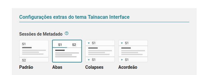
We then have two new possibilities: to see the sections organized in tabs or in expandable panels (we call it “Accordion” when only one panel can be open at a time, and “Collapses” when several can be open at the same time). Having saved these settings, go to your item page to see how your data can now be presented.
This is just the basics of what we can create. For developers, the metadata sections will be handy in creating much richer layouts for displaying items. See examples such as FILE Archive, which has greatly customized its item’s page. The sections will help you prioritize information, better organize your submission forms and, in addition, fulfill a role that was often wrongly done by the Compound Metadata, which has different goals from the point of view of the information structuring.
Item Media Gallery Block
If today we depend on Tainacan compatible theme configurations to display our items properly, the future is much brighter, and we believe that any theme will be able to display Tainacan lists and items as greatly as Tainacan Interface and Blocksy do. Part of the movement needed to get to this goal involves us creating Gutenberg blocks that display the content we usually find on an item page. The first of these, of course, is the media gallery, as we refer to the component that renders the Document and Attachments of an item. It is the one that offers a Zoom modal and a carousel navigation between each media, be it an image, video, text, embedded content (YouTube, Google Maps), etc.
To insert a media gallery into a page or post, simply browse for the new block and select which item you want to show there. Once selected, you will see the documents and attachments appear as a carousel.
Notice that, as with other blocks, this block will not have all the interactive features in the editor, you need to publish the page to see the carousel and zoom in action. There are also a number of options that can be customized. You can choose to display just a carousel with small images that zoom in when clicked, or you can display the top (main) carousel with the thumbnails below fulfilling a navigational role. Options for size, spacing and colors are also available in the block settings in the sidebar.
As we said, this is a first step towards a future build of the item page in the editor. Keep an eye out for upcoming releases!
Improvements
Advanced Search Refactoring
One feature that was certainly under-explored but had a strange interaction is Tainacan’s Advanced Search. After some discussions about the functionality of this component, we changed its behavior to look less like “another page” and more like a panel that pops up with filtering options. Along with this came some bug fixes that may be noticed by frequent users:
Reorganization of the Item Editing Screen
The layout of the item screen has undergone some changes for the arrival of the sections. One of the most eye-catching is that the Attachments are put (actually moved back) underneath the Document and Thumbnail. This is to make the media components closer to each other, and to reinforce the aspect that the Document itself can be an attachment. Previously hidden in a tab, attachments now have this new space to be accessed by users who need it.
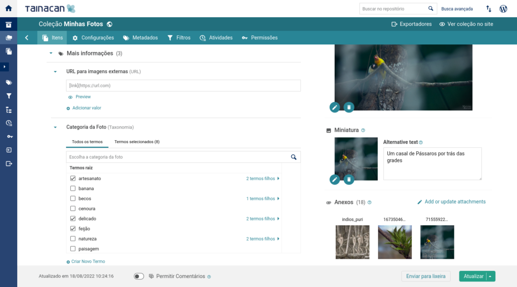
If you don’t like this change, you can set this location via a variable that is available for developers (see below the For Developers section), but will soon have its place in the user interface as well. Finally, to reduce the vertical space before the metadata section for good, we have sent the button for enabling comments to the gray footer.
Rethinking the Update Button and Status
The aforementioned change helps us decrease the vertical space consumed until the metadata list is accessed. This benefits smaller laptop screens, and is something we have been pursuing quite a bit at Tainacan. Another step towards this comes with a change in the item publishing flow. Now, when creating a new item, instead of seeing the two radio buttons (public and private), the user will see a “Create item” button which in turn will call up a dialog with the actual status options it has: public, private, and draft.
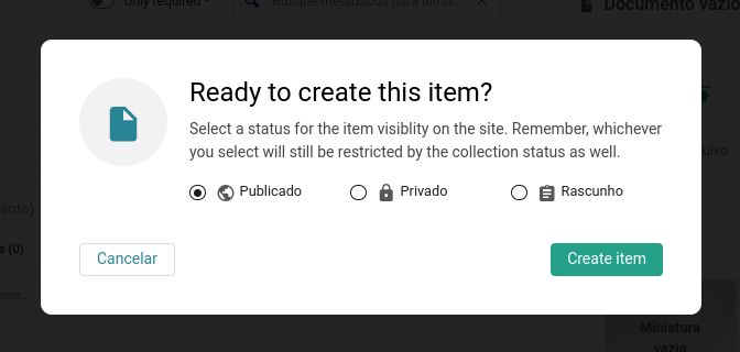
Once one of the three is chosen, the next time the user accesses the edit screen of the item, the refresh button will contain the possible options to change the status, if so desired. Its default behavior is to update the item in its current status. If you want to change it, a drop-down menu of options can be accessed using the little arrow next to the button.
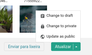
This change aims not only to reduce the number of buttons in the footer, but also to introduce a publishing flow that is closer to how WordPress works. Public, Private and Draft are all statuses that an item can receive, and separating the last one from the first two created some confusion about the visibility of the item.
We are waiting for feedback on this design and if all goes well, we will migrate other Tainacan forms to something similar.
If you are one of the users with 50 metadata to fill in your item, this is for you. It started as a feature designed for small, mobile screens, but we have brought it to all screens. When you click on the “Start focus mode” button above the list of metadata, other interface elements will loose focus, and you can browse metadata by metadata by clicking on the arrows in the footer:
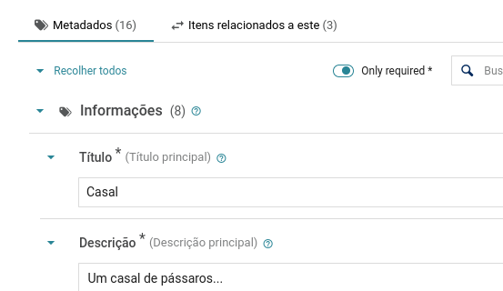
Required Metadata Filter
Also on the item edit screen, you can now enable a filter to see only the required metadata, helping you to prioritize what should be filled in right away:
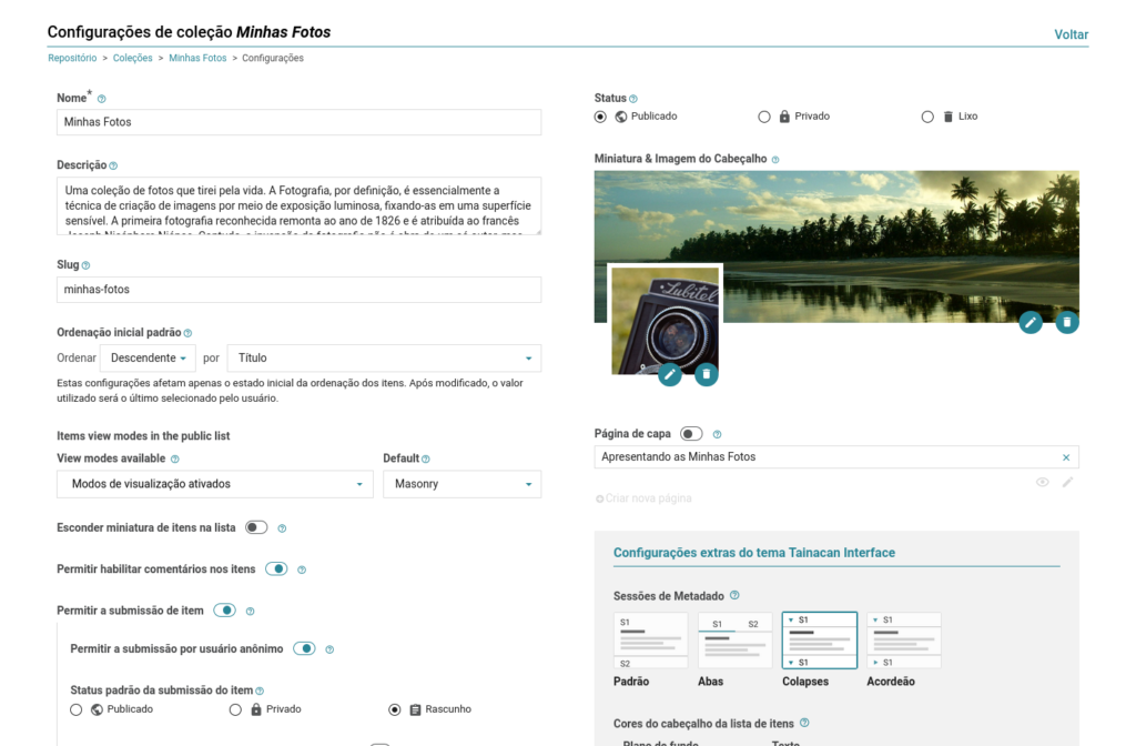
Reorganizing the Collection Editing Screen
The collection configuration form has also undergone some adjustments. These are largely changes to the order in which things are presented, to make room for the settings of the metadata sections. Most notable will be the positioning of the overlapping cover image and thumbnail. As the help field for this section will make clear, the idea is to reinforce that the cover image fulfills a more decorative role while the thumbnail image is the one that will represent the collection in listings.
Metadata Description and Placeholders
Two new options are available in the metadata configuration. The first allows the metadata description, usually displayed in a floating tooltip with the symbol ?, to be shown right below the metadata name. This option already existed for the item submission block and is now also present in the item editing screen. And to further guide this filling out, we are also allowing placeholders for metadata that have a text field to be configured. So you can write guidelines that help the person who is filling out the metadata with examples like “Enter your full name here…”.
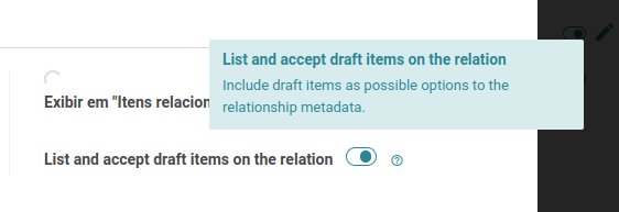
Relationship among Draft Items
A new option is available for the relationship metadata. You can now establish links to items even if they are in draft status. With this, even if your edit flow does not yet allow publishing of an item, you can already make the linking ready.
Filters that “Start Disabled”
Filters that display a list of possible checkbox values now have a new option: Start disabled. This implies that in the list of filters, they will be collapsed and with a slightly lower opacity. Only by clicking on it the first time will the facets with the possible values be displayed. The motivation for this is a performance issue: facets weigh heavily on the search and a filter list full of these can impact the response time. So if you want to show several filters without slowing down your list, we suggest using this option that still gives the user the possibility to see more information.
New image size: tainacan-large-full
Nowadays, images uploaded to Tainacan generate three new image sizes in the database: tainacan-small, tainacan-medium and tainacan-medium-full. These sizes are used by the interface in different contexts. As of version 0.19, a new size will be generated, the tainacan-large-full, a non-cropped version of the image of approximately 480x860px, which can be used in blocks and in other situations where the previous cropping was not sufficient, such as…
Masonry View Mode with Larger Images
In our Masonry view mode, the number of columns per screen always made the images small and the titles often generated too many line breaks. Based on other digital repository interfaces we have found across the web, we decided to reduce the number of columns – thus increasing the image size – taking advantage of the new image size available from Tainacan. This should give more prominence to the item media. If your collection was created before the new size existed in the database, we will use the large image size that WordPress itself generates.
If you don’t like this new layout, you can go back to the old one through a filter that can be passed in code, which will be made available on the Tainacan Wiki.
Image Size Option in Tainacan Blocks
The Tainacan blocks that list items and collections have a new option, which allows you to choose the size and cropping of images to be loaded into them. This option replaces the option that previously “forced cropping” of images. With this, the user can choose the most appropriate size depending on the context in which the list is being displayed.
And much more!
- Updating of the carousel and zoom gallery libraries;
- Replaced the tooltips library;
- Updated library that shows embedded PDF documents;
- Various improvements to the responsiveness of the item edit page for small screens;
- Display of compound metadata within relationships;
- More highlighting of the thumbnail image alternative text field;
- Up and Down sorting button on the metadata and filter list (for those who don’t like to drag and drop…);
- Display of a label indicating which of the attachments is the document;
- Fixed header in the listings of Activities, Processes and Permissions to facilitate the search if there is vertical scroll on the screen.
For Developers
As already mentioned in this post, this version introduces some new options that can be accessed by code. In particular we have:
- New Javascript filters: We now have client-side hooks for adding elements to various sections of the item list, as well as customizing some options like the masonry layout;
- New template tags for the metadata sections: Theme developers will have plenty of flexibility to create new layouts for the item page using the function that lists the metadata sections;
- New settings to change the Tainacan Admin: A new filter allows more than 90 variables to be passed for customization of the Tainacan admin panel. These filters include in particular options for hiding elements, making the interface simpler depending on the user’s context;
- Form hook per specific metadata. The form hooks filter now receives an extra parameter if you are adding form elements either to the metadatum or to the metadata section form. This way you can implement options only to certain type of metadata, for example.
- New form hook for the user role permissions form: As with metadata, filters, collection and items, now the form where we edit user permissions can also be extended with new fields via code.
Get it now!
Version 0.19 of Tainacan is now available. You can download or update it directly from your WordPress dashboard: